Designers
GoTyme Bank Design Team / Silvano D'Orazio, JM Elimanco, Van Nguyen, Long Tran, Hoa Linh Mai, Isabel Abella, Hai Tran, Phong Nguyen, Tram Nguyen, Valentin Cheval, Hieu Cao, Christine Enerlan, Minh Le
Year
2023
Category
Product
Country
Philippines
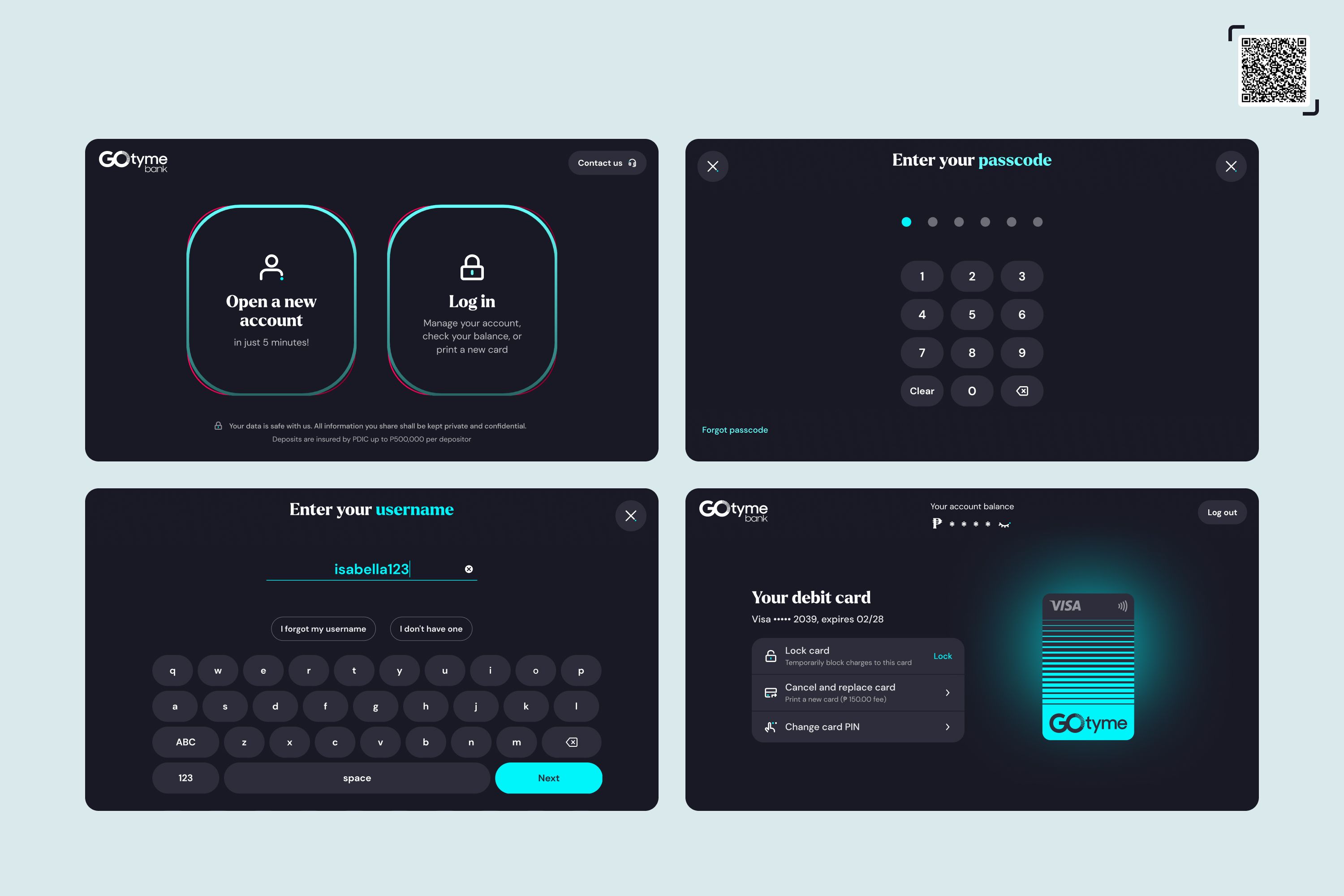
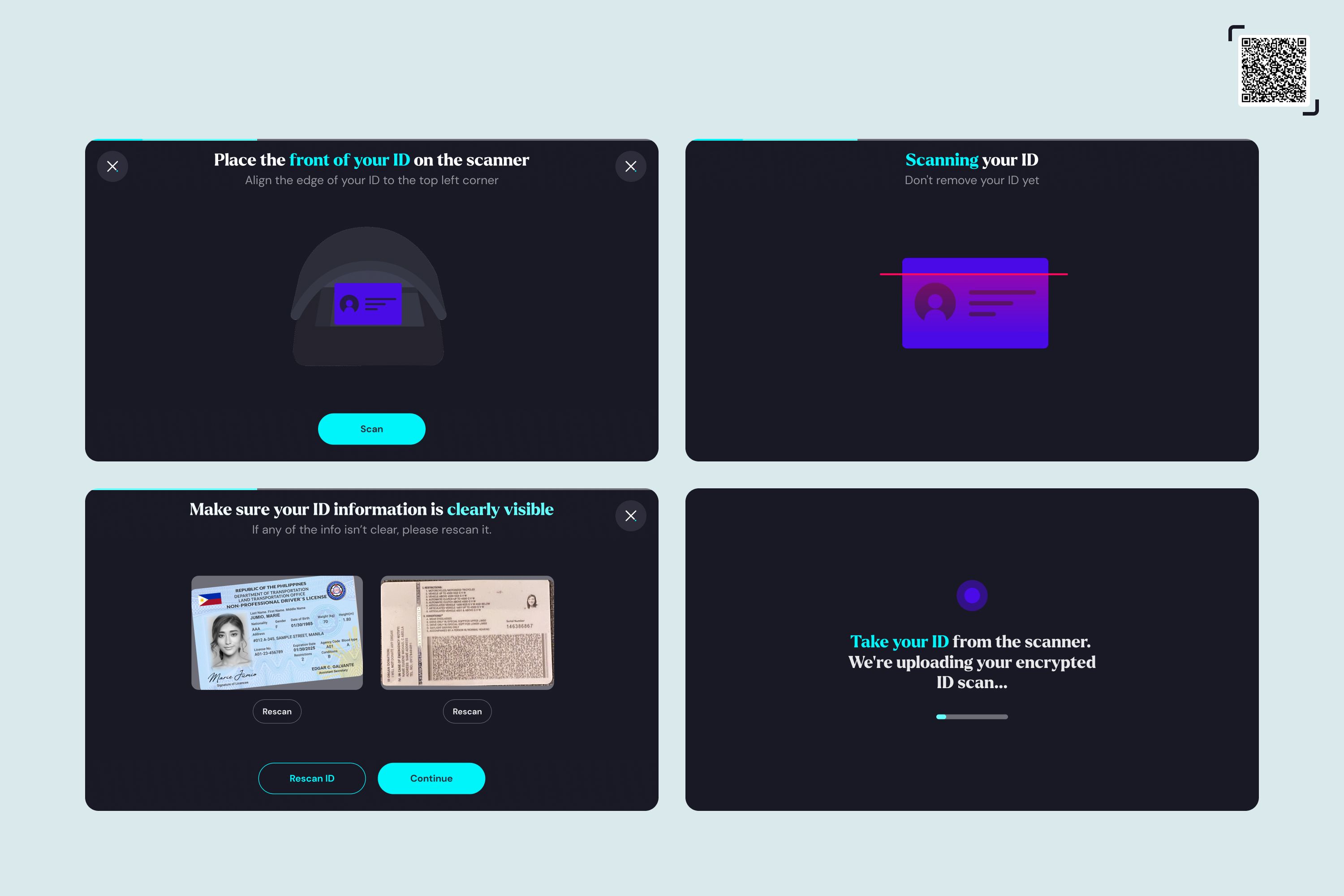
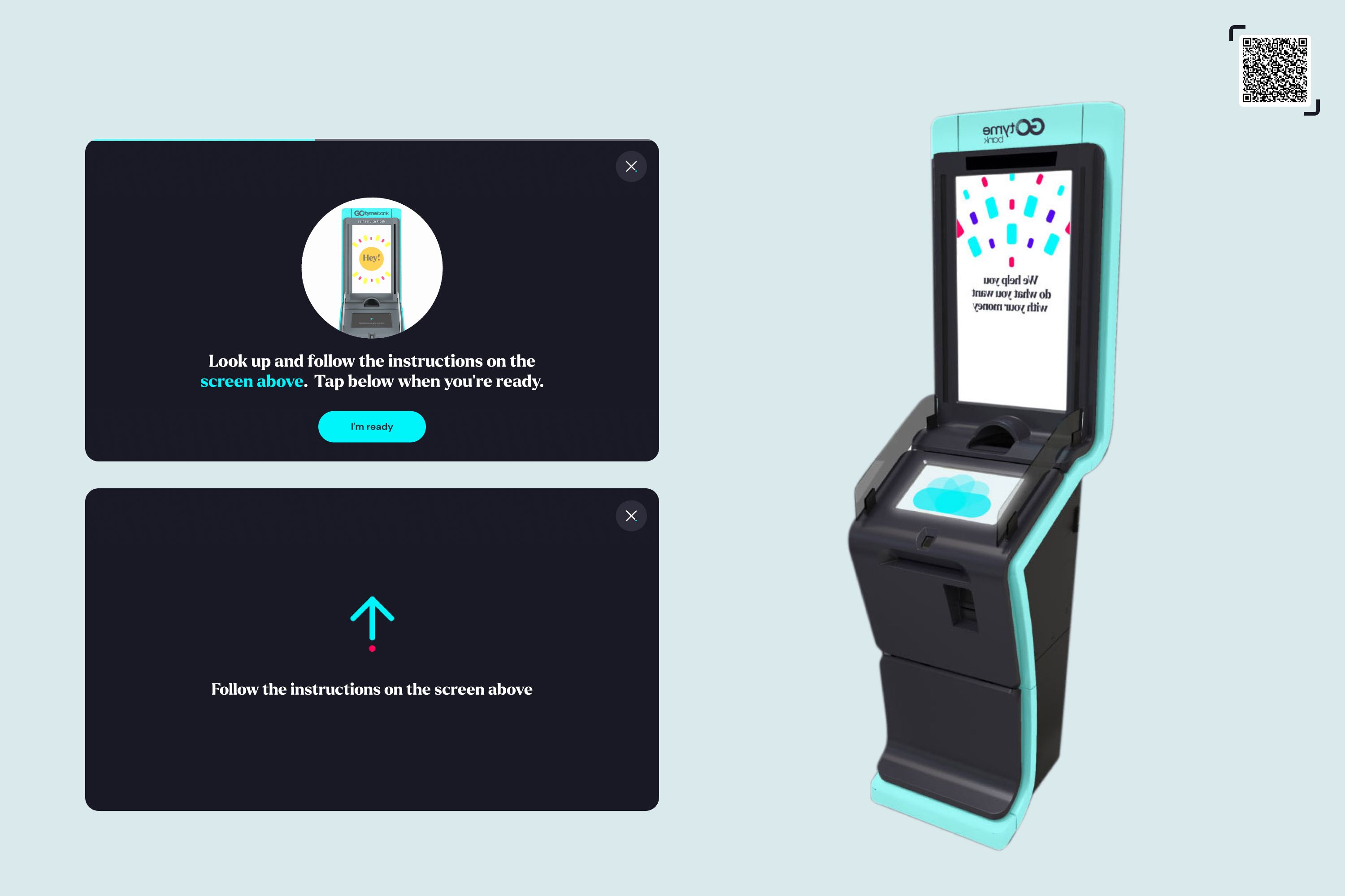
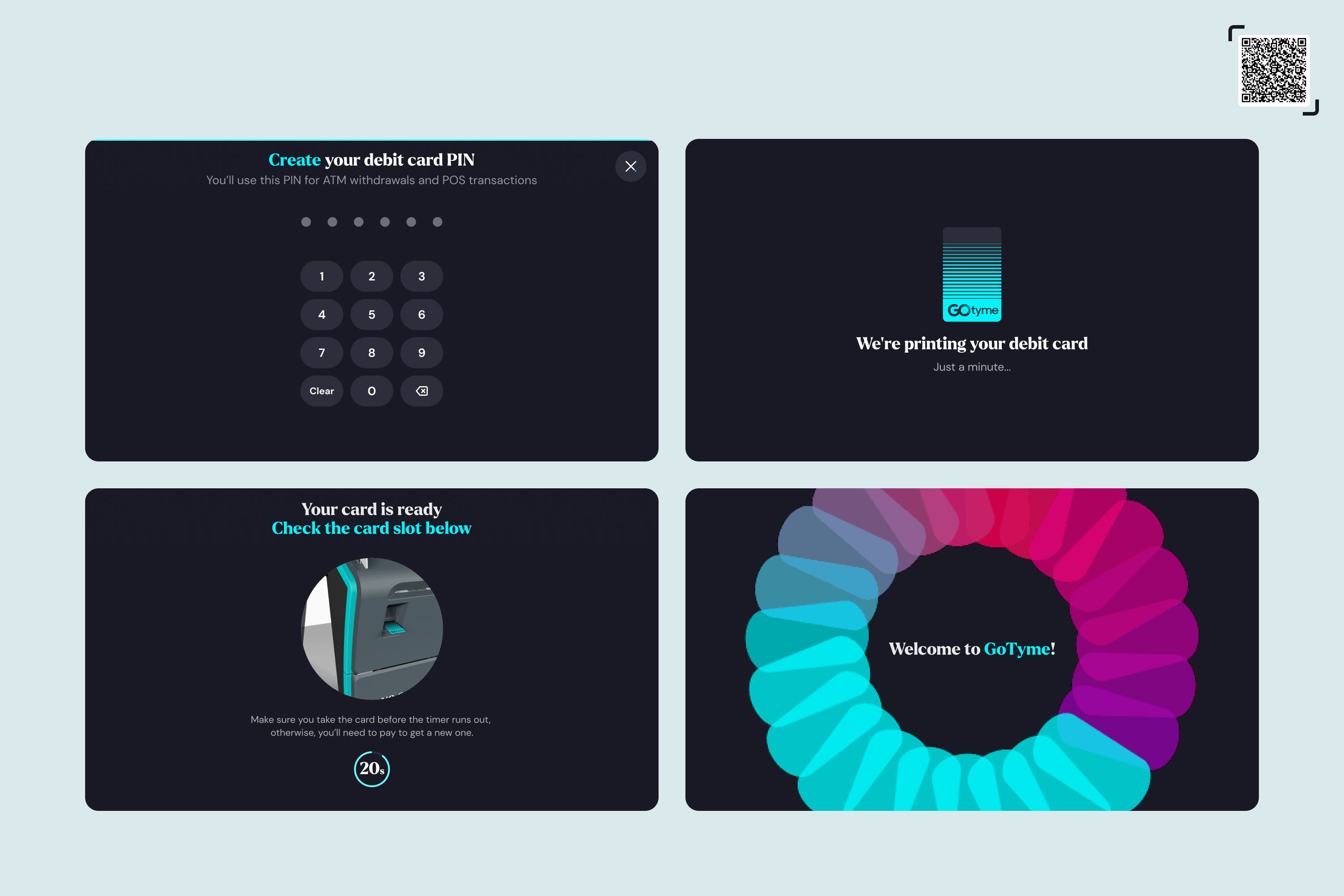
»The world of innovation is divided into two camps. In one camp visionaries with flat whites in their hands discuss moonshots and come up with faux 'what if' questions. And in the other camp, creatives are serious about their real 'what if' questions and really do it. While the GoTyme Kiosk is not a revolutionary thing, it certainly is a big thing. The utterly ruthless single-mindedness of the very idea is why this product deserves to be a winner. This is the perfect way to provide banking for all in The Philippines. This may be an unpopular thing to say, but you don't always need AI and ocean plastic to make impact. Just like their Banking App, the GoTyme Bank Kiosk thinks how people think: If I want a bank account, I’ll just go do it at a kiosk and immediately get my new card. And just like its Banking App sibling, the kiosk too shines with great visual design that embodies the vibrant GoTyme brand tonality. If we, the jury, may just add one wish it would certainly be to rework the kiosk (hardware) design itself... this is where we see room for improvement!«
Joon-Mo Lee & Shruti Ramiah

Three questions for the project team
What was the particular challenge of the project from a UX point of view?
The challenge of designing the GoTyme Bank Kiosk comes from the fact that the product was both the first of its kind in the Philippines and was primarily meant for users who are held back by their unfamiliarity with banking services. For it to serve its purpose, the kiosk had to be learnable, usable, and engaging enough despite its novelty as well as the difficulties that most of its target users are known to face. The team had to think beyond UI and technology and include UX solutions that draw from the bank’s operations and growing online community.
What was your personal highlight in the development process? Was there an aha!-moment, was there a low point?
The highlight of the project was the overwhelming positive feedback that the GoTyme Bank Kiosk received as early as its beta release—both from its intended users and from highly respected names in the finance industry. In 2022, the team won the award for “Best Innovation for Card Acquisition,” a recognition given by Visa, primarily for the kiosk’s user onboarding and card-printing features. Finding out that the kiosk’s availability in supermarkets and retail stores, combined with on-site human assistance (now known as “supermarket banking” in the Philippines), can boost user activity and engagement was the team’s a-ha moment. To date, the project, which is relatively still in its early stages, has had no major low point worth considering.
Where do you see yourself and the project in the next five years?
The team aims to make the kiosk available in more supermarkets and retail stores all over the country and discover more ways in which the kiosk can help unbanked Filipinos access banking products. This is in keeping with the overall goal of reaching 10 million users in 5 years and enabling more Filipinos to unlock their financial potential.


