Designers
MPS B2B UX, SRCA B2B UX / Sylvia Leung, Rock Leung, Shayatri Pranay, Emily Rupert, Annie Wong, Andy Yeh
Year
2023
Category
Product
Country
United States


Three questions for the project team
What was the particular challenge of the project from a UX point of view?
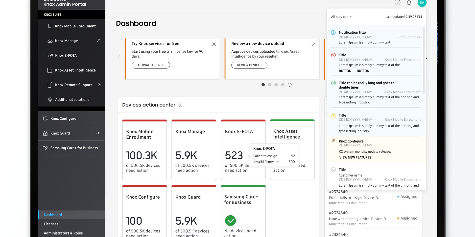
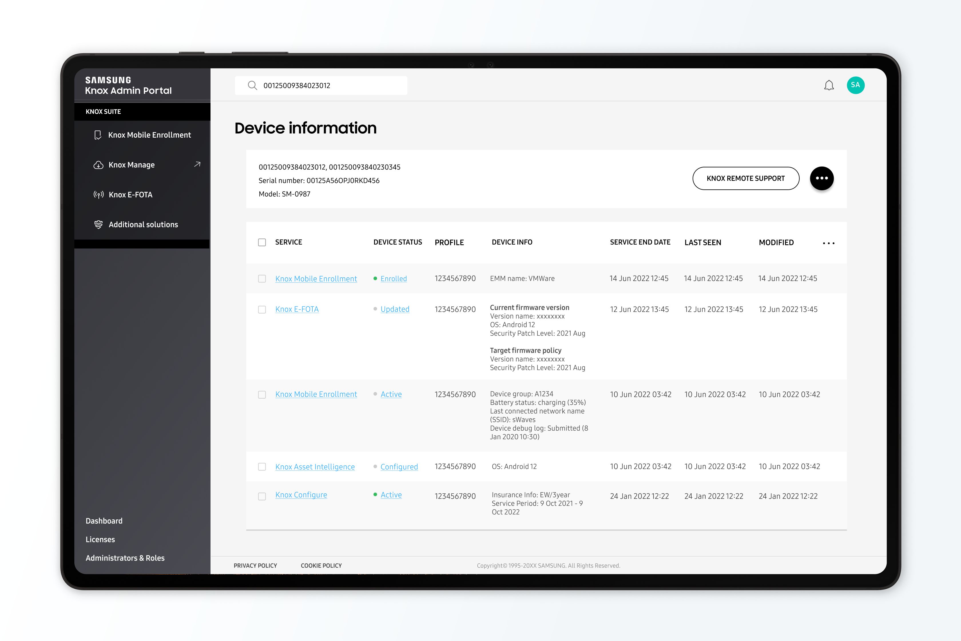
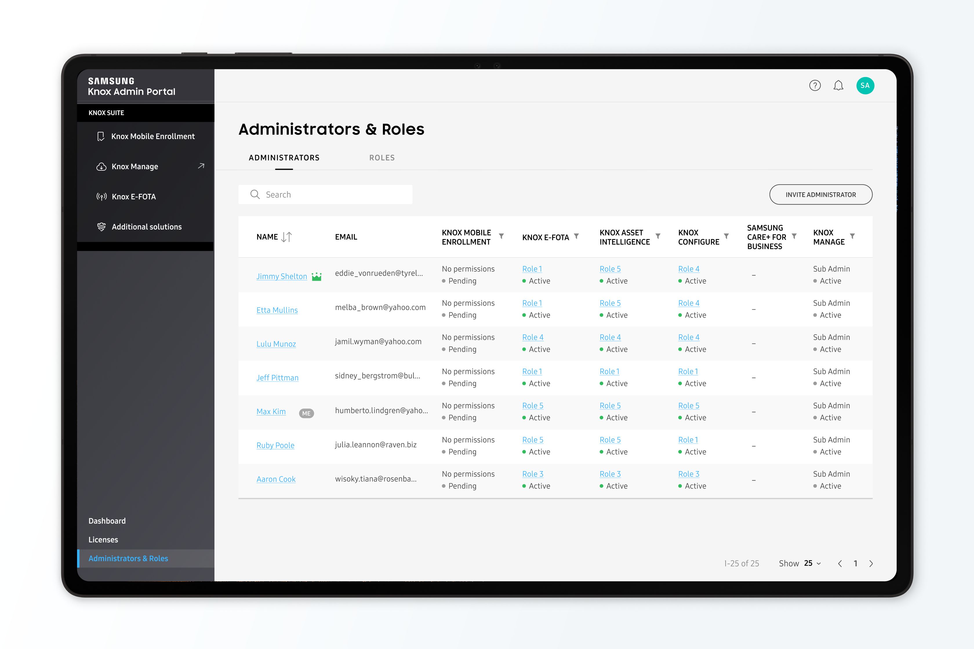
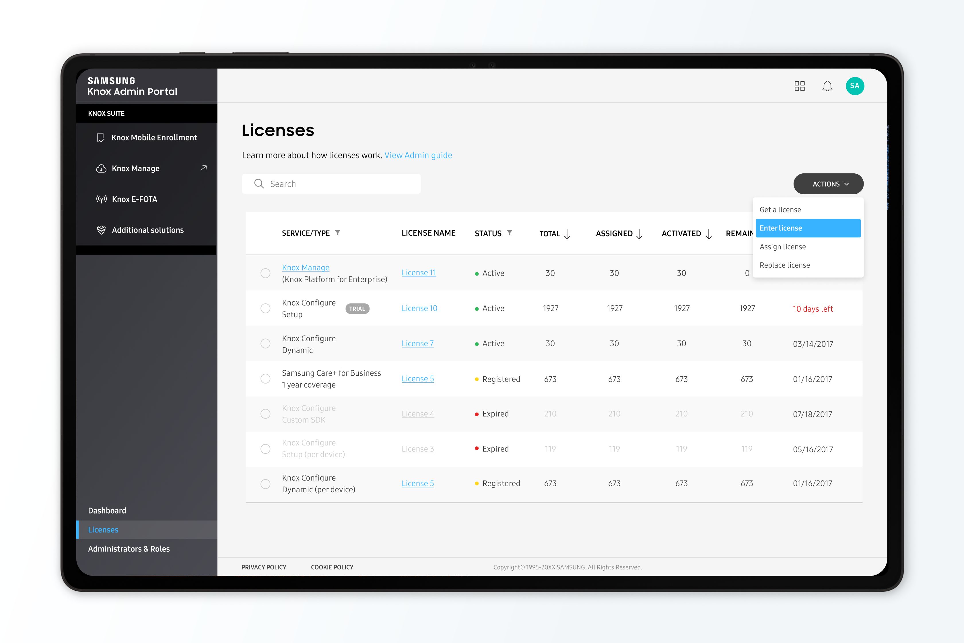
Knox’s approach of having differentiated products to manage different aspects of device management is unique in the genre of enterprise device management solutions. New users just discovering our product are used to the more common method of having all aspects of device management rolled into a single product, while existing Knox admins knew the purpose of each product and were used to using each Knox product separately. The challenge for the design team was to design a Unified UI that also surfaces the key aspects of each product in an intuitive way for both new and existing users.
What was your personal highlight in the development process? Was there an aha!-moment, was there a low point?
There were a lot of technical constraints that the design had to account for, sometimes the best design solution wasn’t feasible in the short term. Finding a work-around that straddled both user needs as well as technical constraints was definitely a high point. There was a lot of conflict about what users wanted to see in the landing page, if there should be a focus on more informational how-to content, or if admins would be more interested to see more high-level summary content of their services\; I found it gratifying to find a solution that surfaces a combination of both at the right time for new and existing users.
Where do you see yourself and the project in the next five years?
The design team continues to engage users on a regular basis to identify improvements that will lead to a more seamless experience for our users of multiple Knox products. We project that greater accessibility and easier transitions between each Knox product will lead to a better experience and more traction with the Knox offering as a whole.

