Designers
Bruno Barros, Bruna Mattos, Maria Tarrafa, Tainá Barbosa, Murilo Porto, Malu Agostinho, Lais Nunes, Sandy Zambeli
Year
2024
Category
Product
Country
Brazil
Design Studio / Department
Chapter Design

Three questions for the project team
What was the particular challenge of the project from a UX point of view?
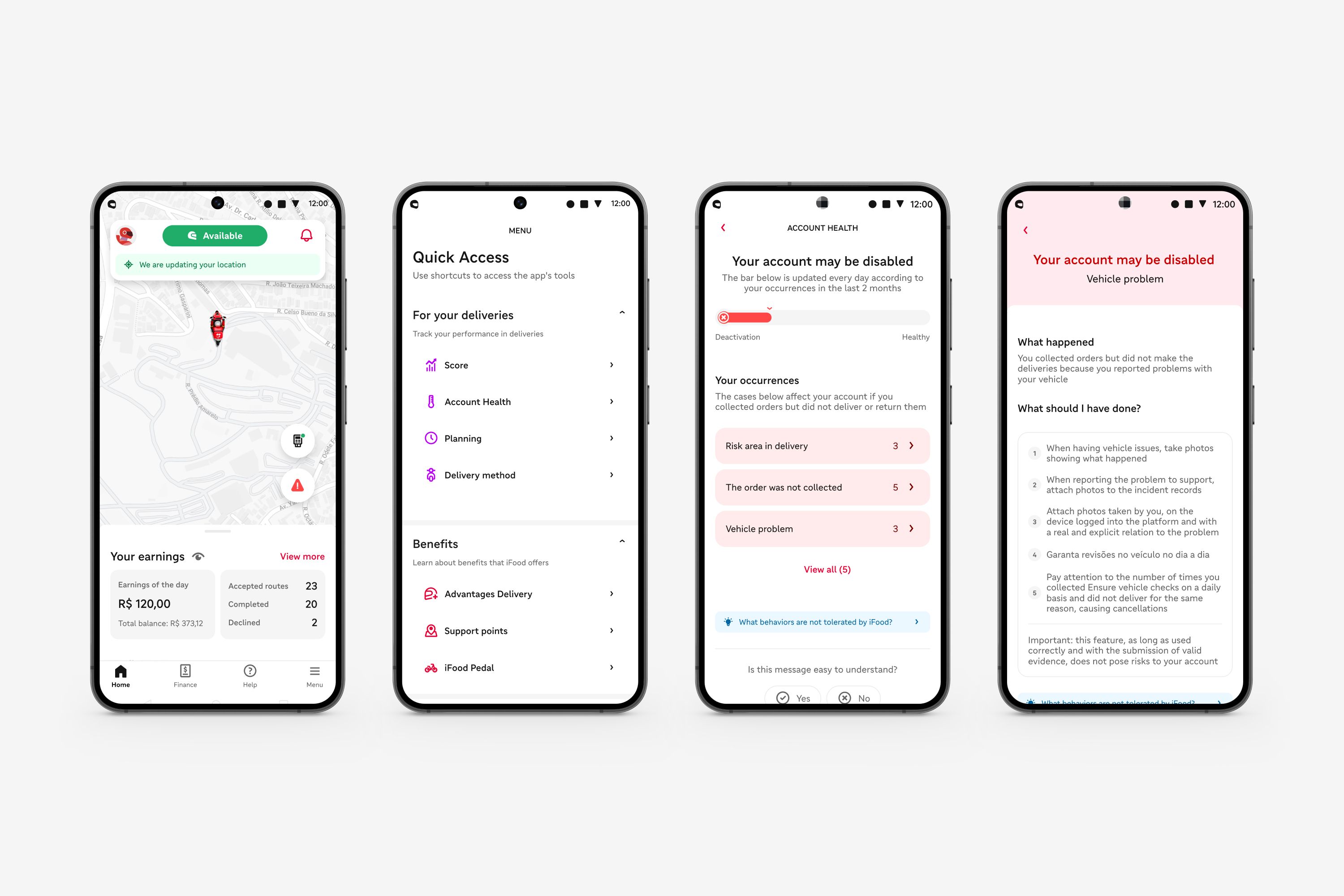
The biggest challenge was to develop a clear and easily understandable solution that met the specific
needs of iFood delivery drivers. We aimed to create an interface that provided visibility into the business rules and offered tips for improving behavior during daily deliveries, in a way that would not impact their earnings and their account on the app. During the UX process, we conducted various research,
co-creation sessions, iterations, and usability tests to ensure that the solution was functional, intuitive, and accessible.
What was your personal highlight in the development process? Was there an aha!-moment, was there a low point?
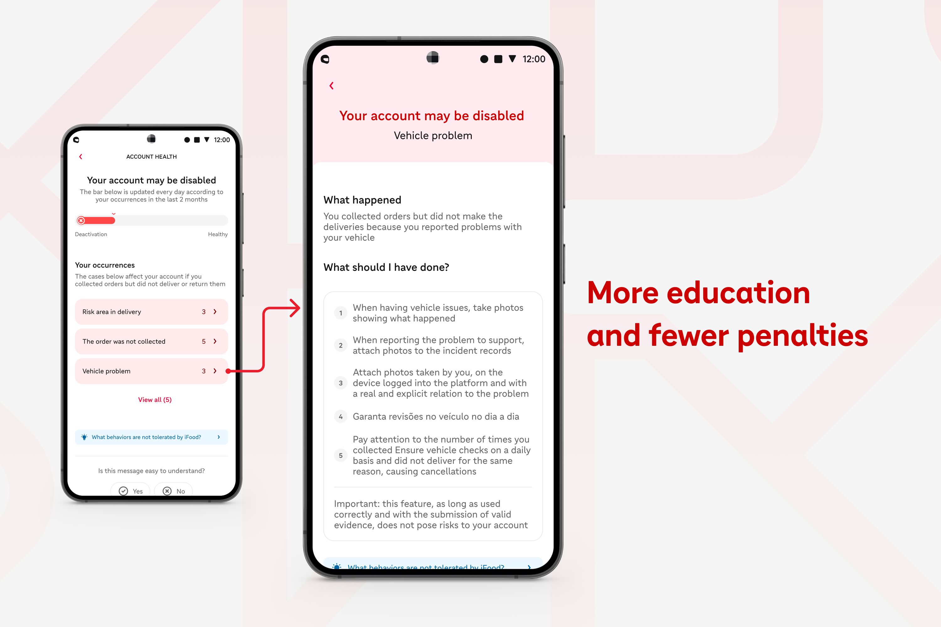
The "Account Health" feature emerged from the delivery drivers' concerns about the lack of transparency in the 'iFood for Delivery Drivers' app. Therefore, my personal highlight occurred when we managed to translate all these concerns into a product that added value for the users. Initially, the first versions of the product generated many doubts, fears, and comprehension difficulties. After several
iterations, we achieved a more educational and less punitive functionality.
Where do you see yourself and the project in the next five years?
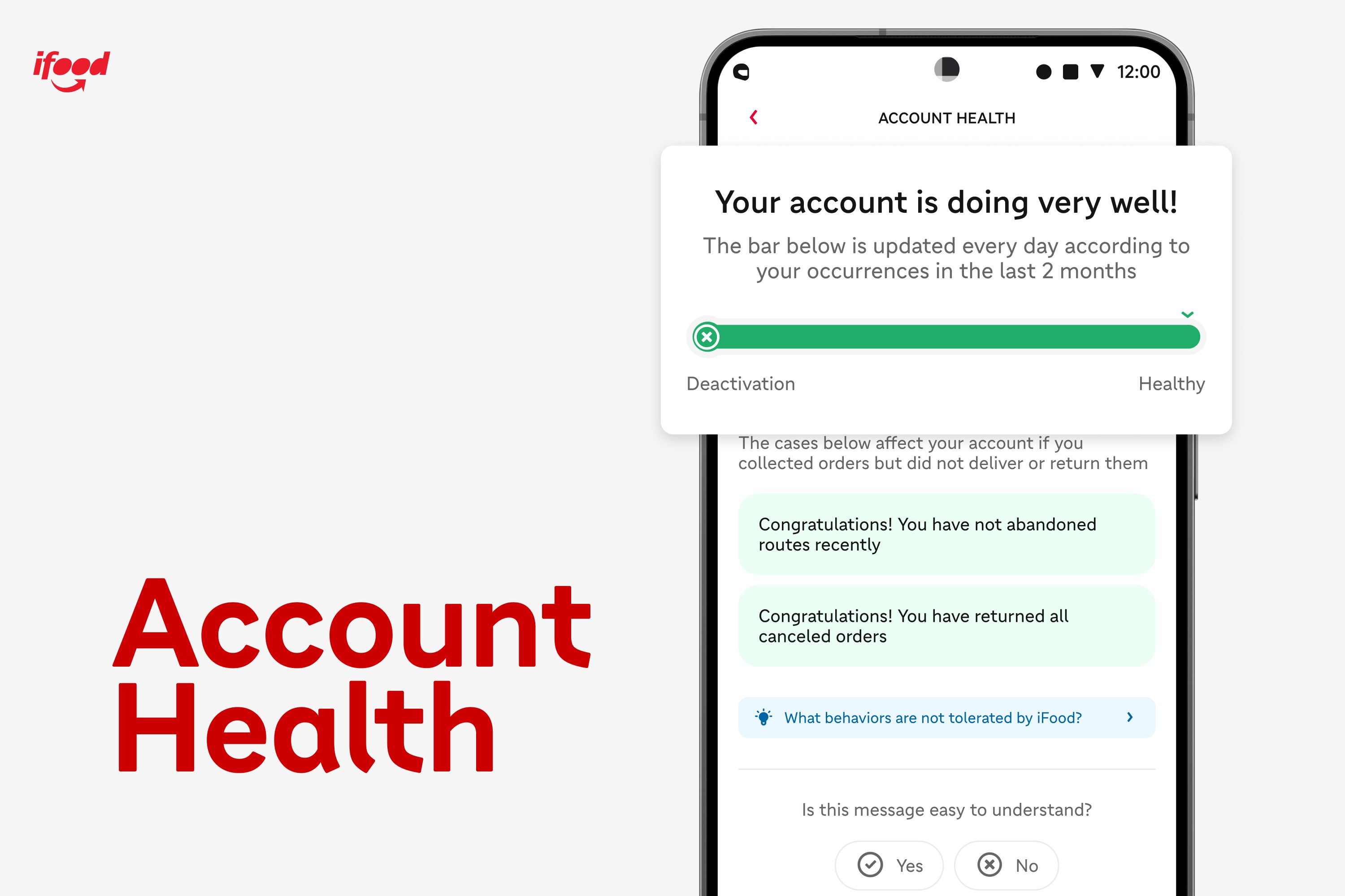
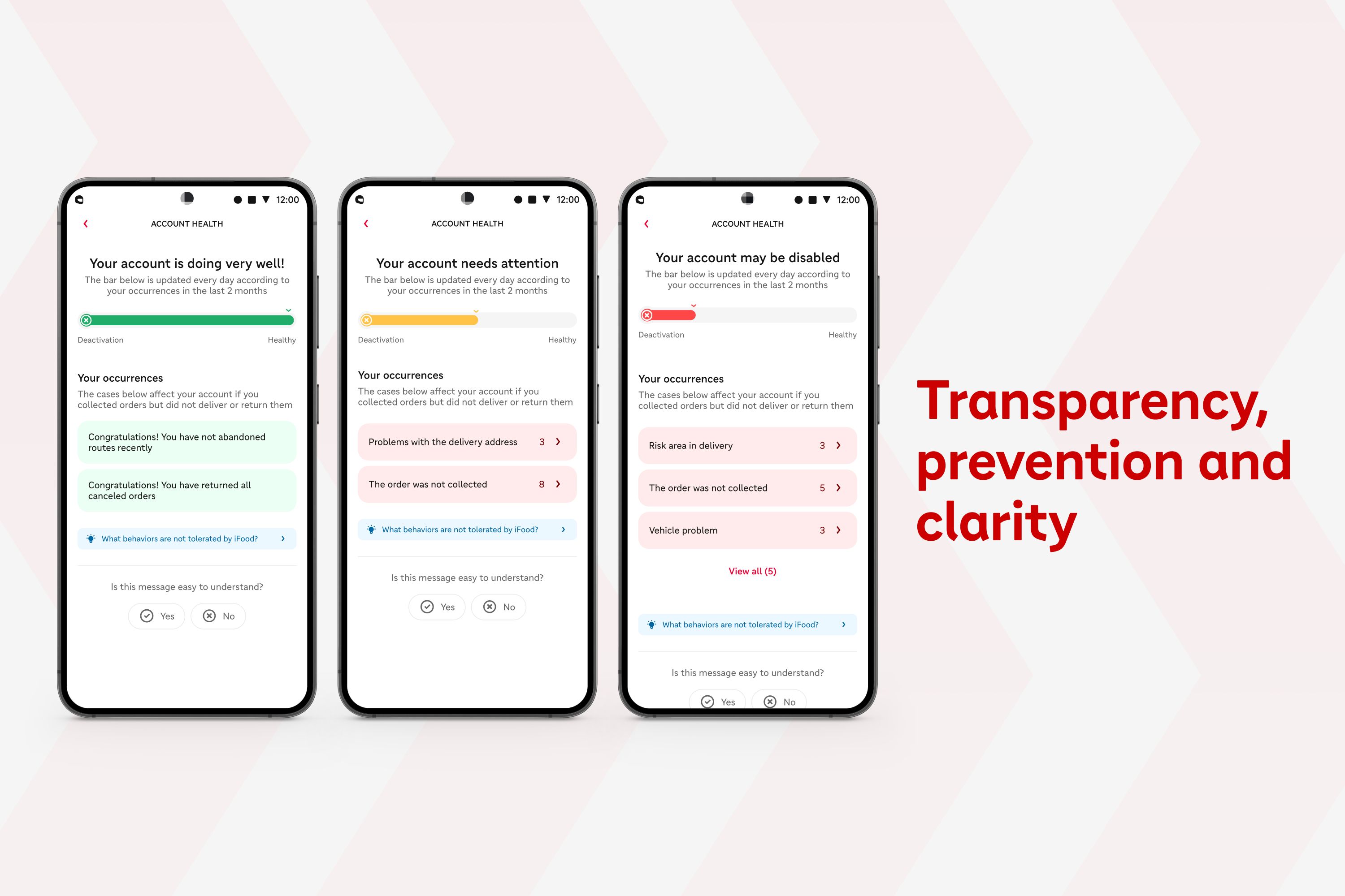
In the future, I envision "Account Health" becoming a supportive product for iFood delivery drivers in their daily routine. In addition to providing a clear view of the account status, indicated by colors such as green (doing well), yellow (needs attention), or red (risk of deactivation), I hope that users will gain more knowledge about the main behaviors expected by iFood, have the ability to submit justifications through closer contact in case of errors, thereby increasing safety during their work journey.


