Designers
Kora Milter, Lilo Hohenberger, Elisa Anderwert, Philipp Flunkert, Maximilian Bückmann
Year
2024
Category
Product
Country
Germany
Design Studio / Department
Merkle Germany GmbH - Digital Experiences

Three questions for the project team
What was the particular challenge of the project from a UX point of view?
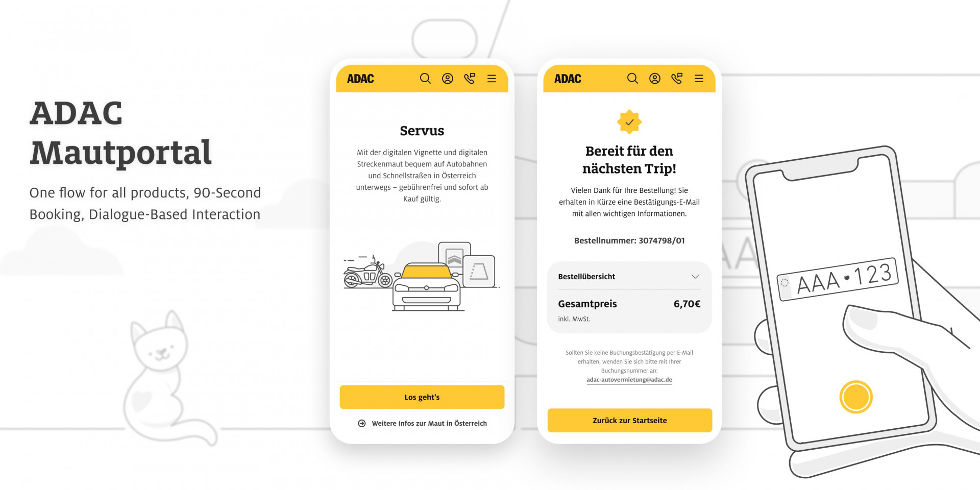
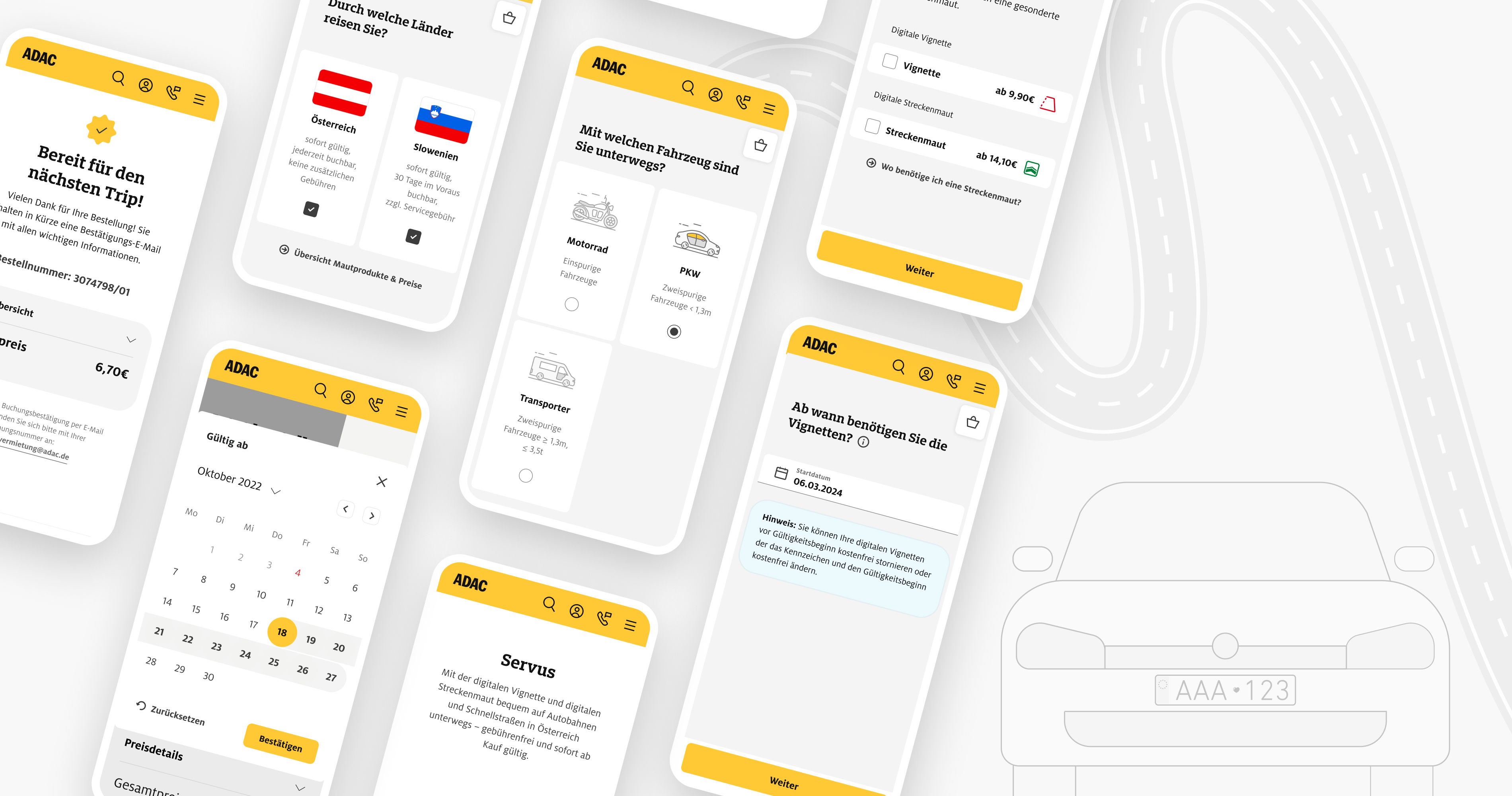
Let's be honest. Hardly anyone enjoys having to book a vignette and deal with the toll systems of different countries. It's even less fun to have to fill out endless forms. The biggest challenge was to combine all the necessary toll information (such as toll product details, vehicle types etc.), toll provider requirements and input fields in a way that was still easy to use and not overloaded or frustrating for users. How can we help users to book the right products and find their way through the flood of information? How can we save users as many information queries as possible and automate them? Questions like these have occupied us in our work on the ADAC toll portal and presented us with exciting challenges.
What was your personal highlight in the development process? Was there an aha!-moment, was there a low point?
Our biggest a-ha moment came during a workshop with the customer. It took place to define how we could combine different toll providers in one flow without making it too complex for the user. At that time, it was already possible to buy Austrian and Slovenian vignettes in separate flows. After several user interviews expressed the wish for a toll calculator instead of a simple booking flow, we finally found a way to realize this wish. All users had to do was provide us with their travel data and we would automatically show them all the toll products they needed. Unfortunately, the low-moment came a little later, when we had to postpone the implementation of that concept to the future and had to pursue a simpler concept for the time being.
Where do you see yourself and the project in the next five years?
In 5 years, we hope to be able to offer our users an intelligent and reliable route planner. We want to make the portal even more user-friendly with the help of tracking data and user tests and work at full speed on continuous improvements. Ideally, it should provide users with all the products they need for their journey across Europe with just a few clicks, without them having to do any research in advance.


