Year
2024
Category
Product
Country
China
Design Studio / Department
Kohler Design Studio

Three questions for the project team
What was the particular challenge of the project from a UX point of view?
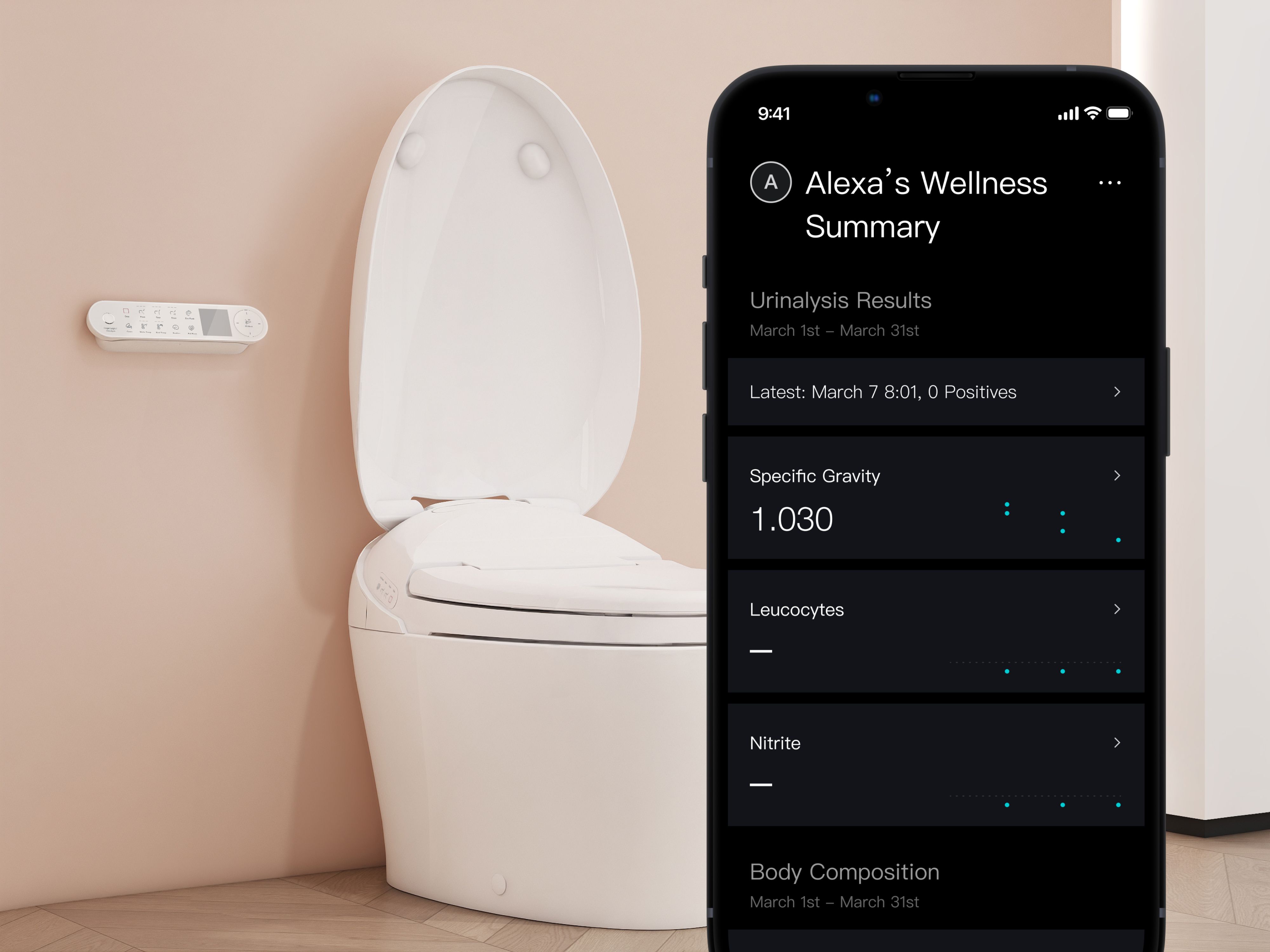
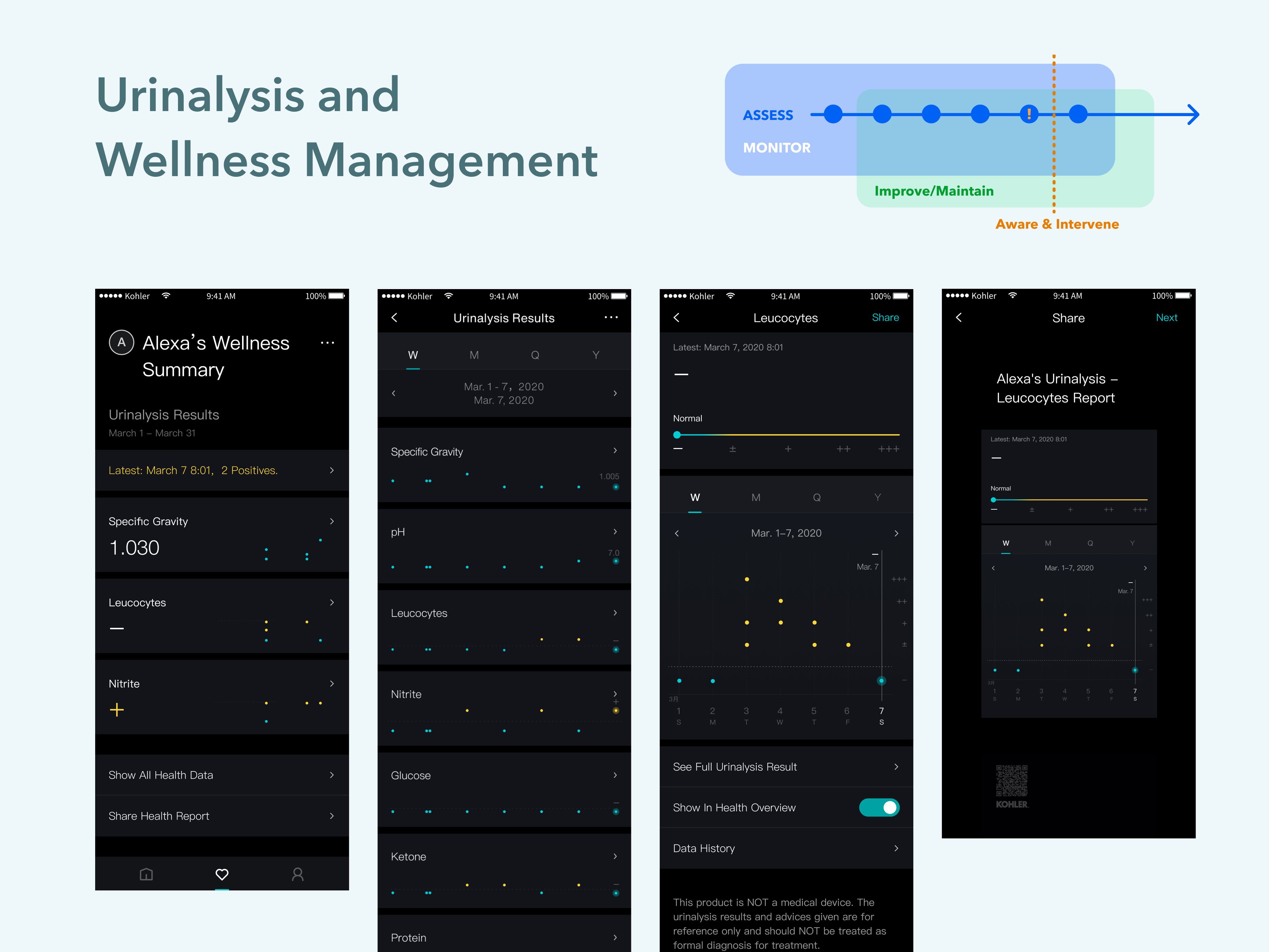
The design aims to meet the needs of users seeking preventive routine checkups and managing their own conditions. For the former, we act as a reliable safeguard\; for the latter, we serve as a supportive companion, avoiding an emphasis on negativities. The challenge lies in balancing the provision of sufficient information to prompt timely interventions, without increasing anxiety for those already dealing with these issues daily.
What was your personal highlight in the development process? Was there an aha!-moment, was there a low point?
An aha!-moment for us is that wellness data isn't black and white; the same result can have vastly different meanings for different individuals. For example a positive in urinalysis result can sometimes be a good thing!
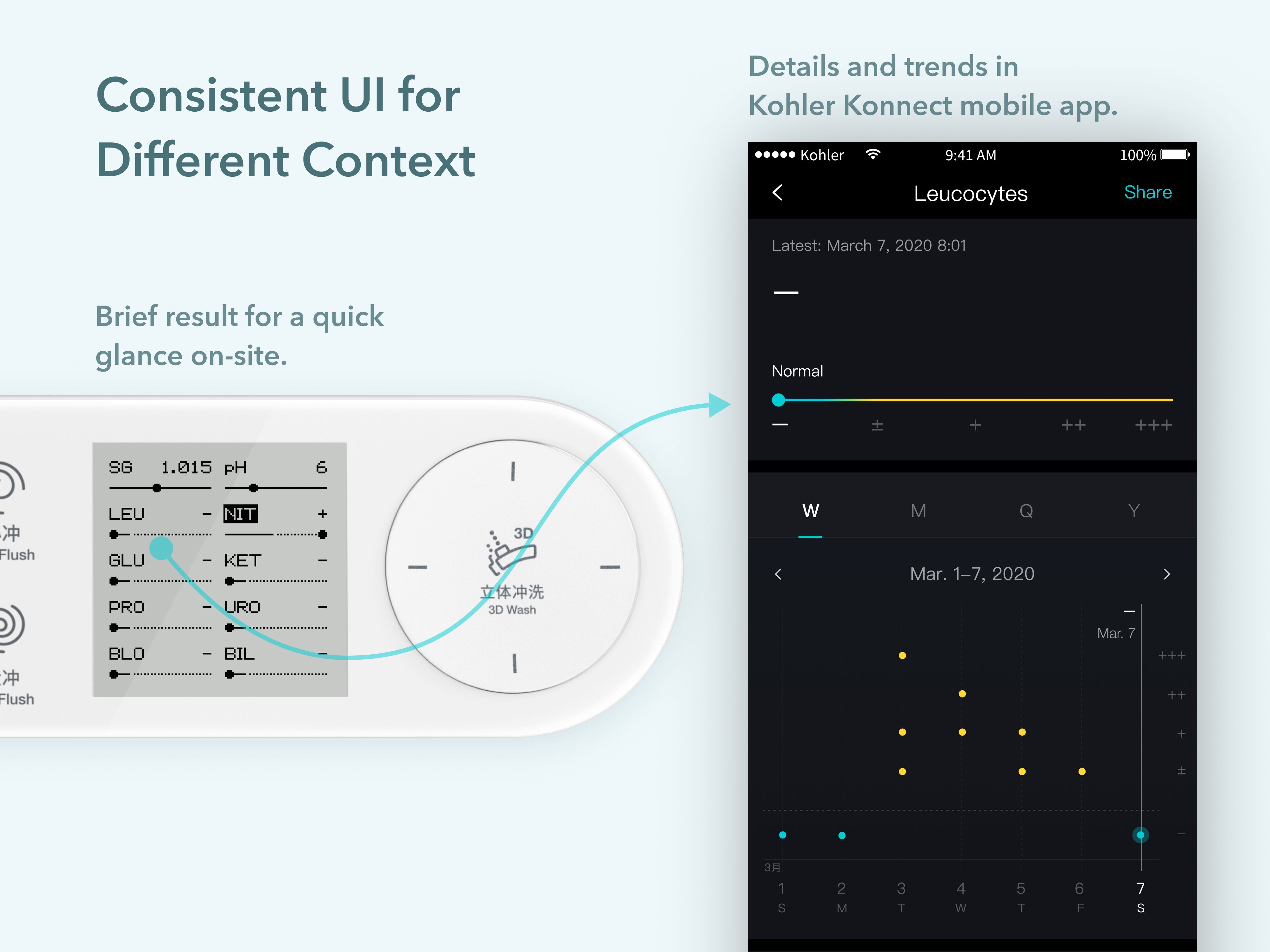
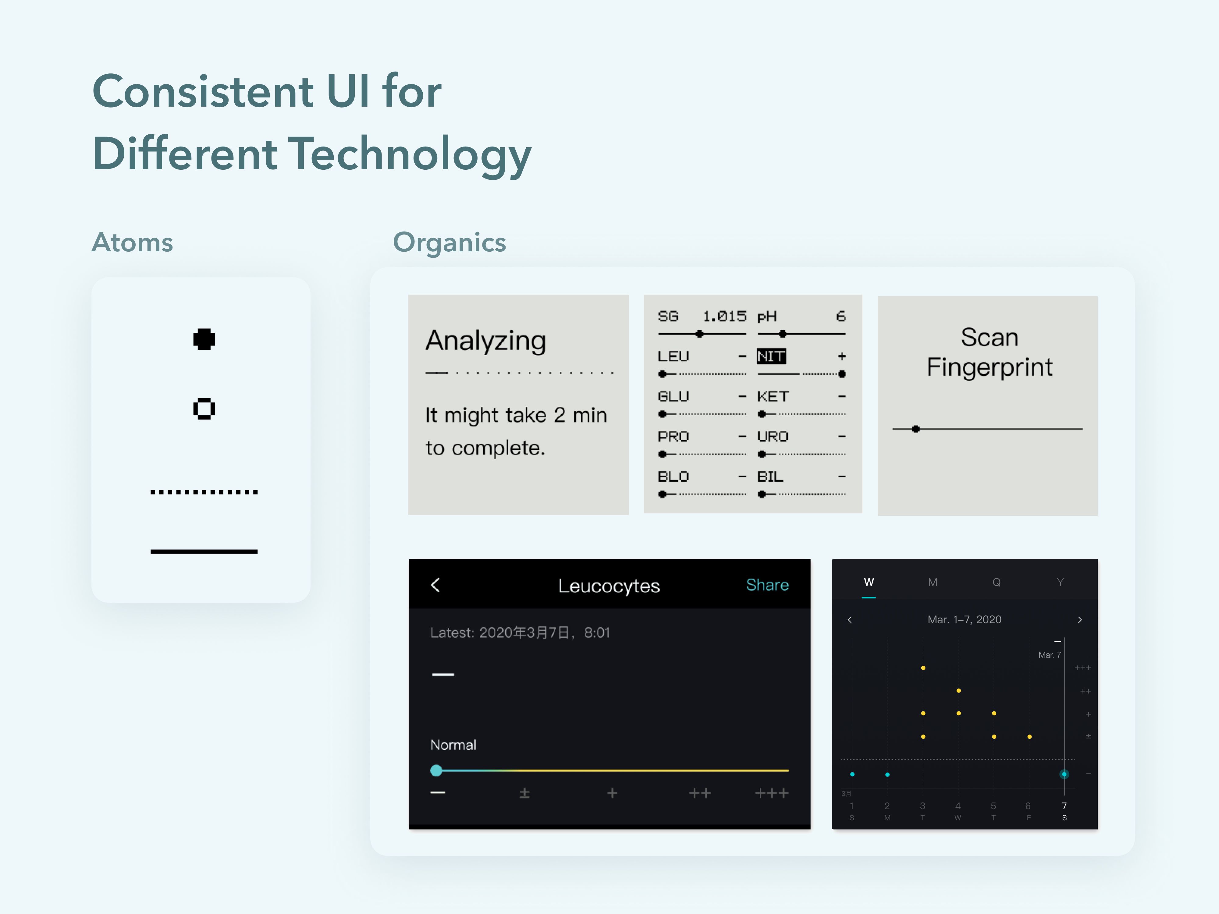
Another highlight for this project is, inspired by current users 'chart reading' behaviors, we integrated an intuitive infographic into our design, alongside the plain urinalysis data. This design is tailored for on-device scenarios, turned out to be quite effective as users can glance result without reading the data. And even first time users are able to quickly pickup.
Where do you see yourself and the project in the next five years?
The product design, particularly the wellness component in our smart home app, aims to establish a foundation for future possibilities of offering expanded wellness-focused services. The bathroom, as a private sanctuary for self-care, holds particular importance. We are committed to developing more human-centered products, services, and user experiences that empower users to live better lives around wellness.


