Year
2024
Category
Product
Country
United States
Design Studio / Department
Design Team, Healthcare Digital

Three questions for the project team
What was the particular challenge of the project from a UX point of view?
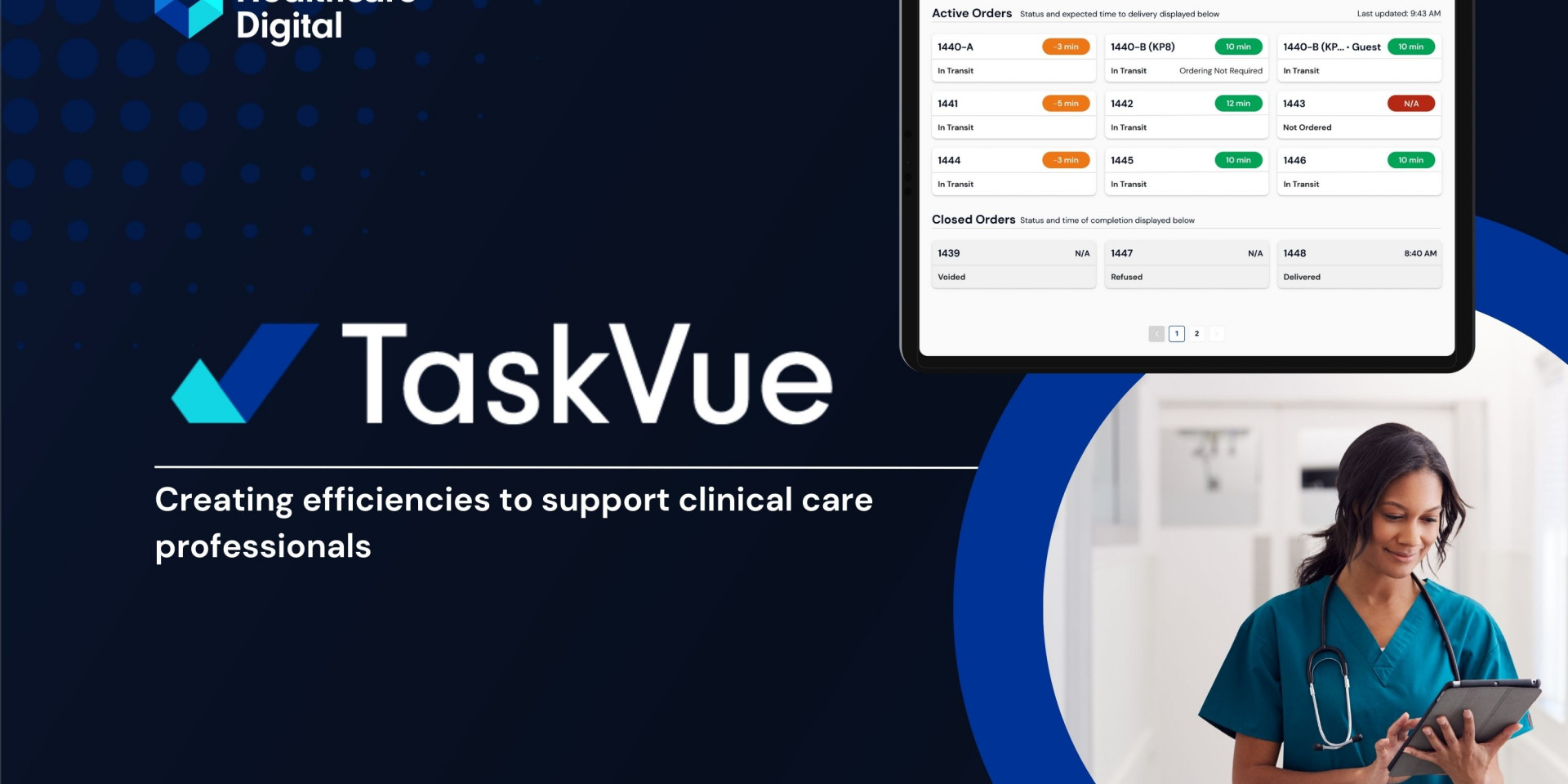
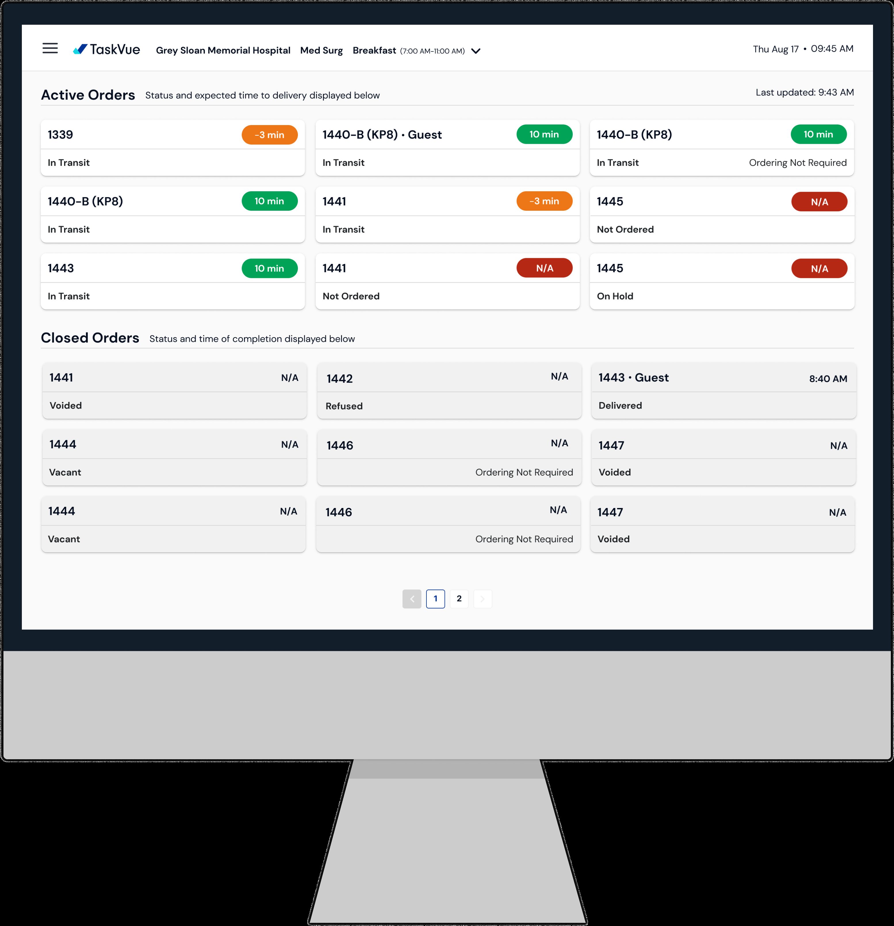
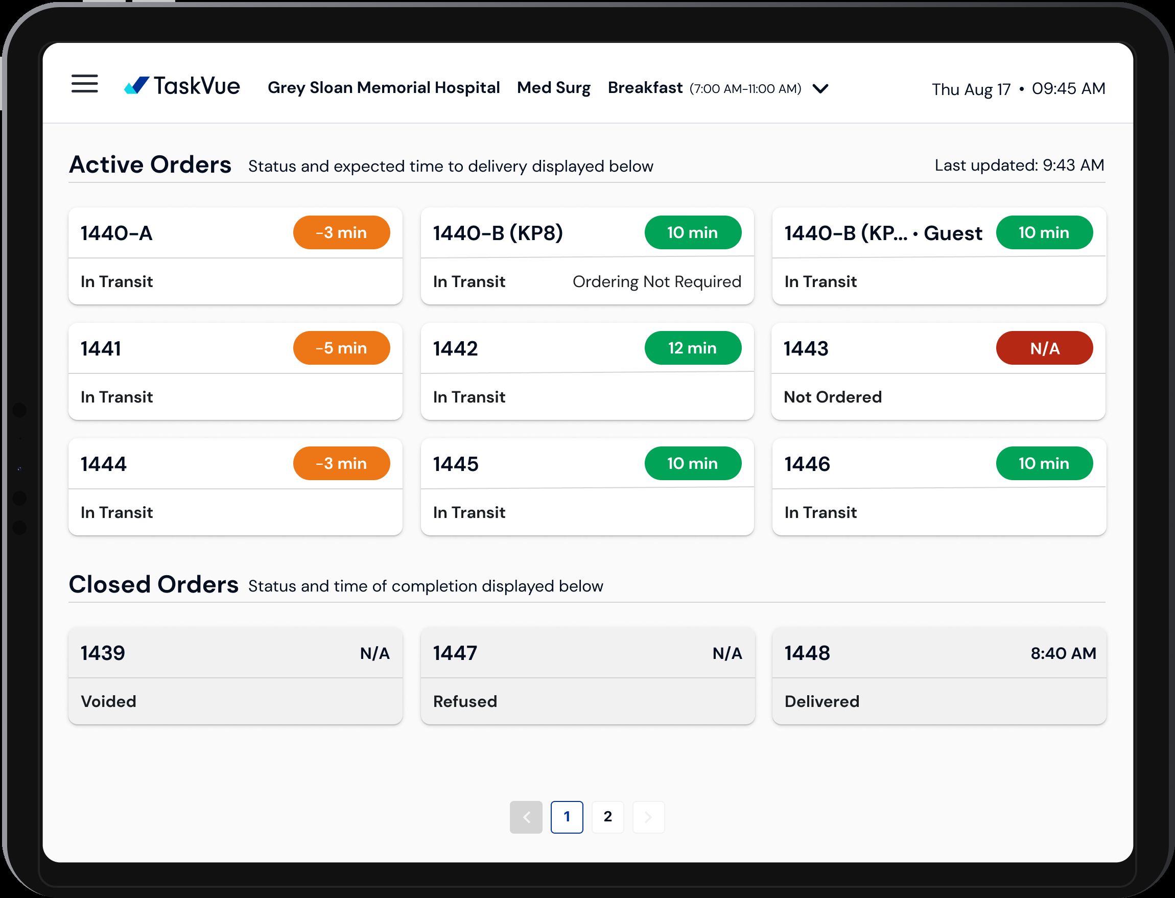
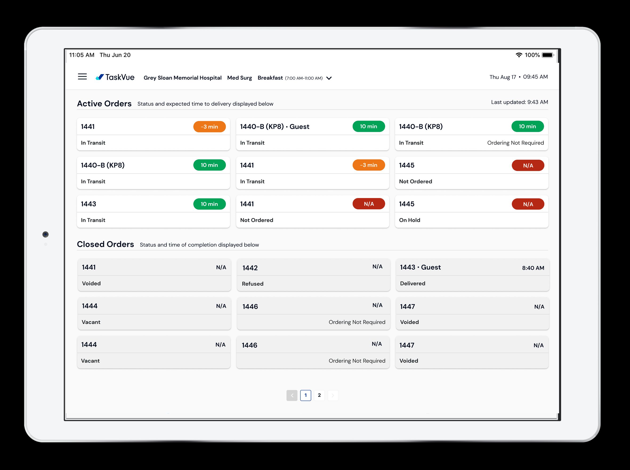
Nurses did not have a quick overview of the status of services like patient feeding and cleaning services. We had to explore the best ways to display the statuses of multiple service lines without cluttering the screen with a quick glance.
What was your personal highlight in the development process? Was there an aha!-moment, was there a low point?
Seeing how nurses were able to regain time and able to focus on clinical work. For example, they do not need to call the back offices to trace down the status of service before they can answer the patient.
Where do you see yourself and the project in the next five years?
We need to understand and design for the needs of other service lines and extend experiences that are nuanced to their needs and ways of operations. From a design perspective, we want to avoid more clutter as we add on more services. We are exploring moving away from a dashboard interface to a summarized, need-to-know type of interaction model.


