Designers
Chris Wilson, David Dell'Agostino
Year
2024
Category
Product
Country
United States
Design Studio / Department
Engineering department
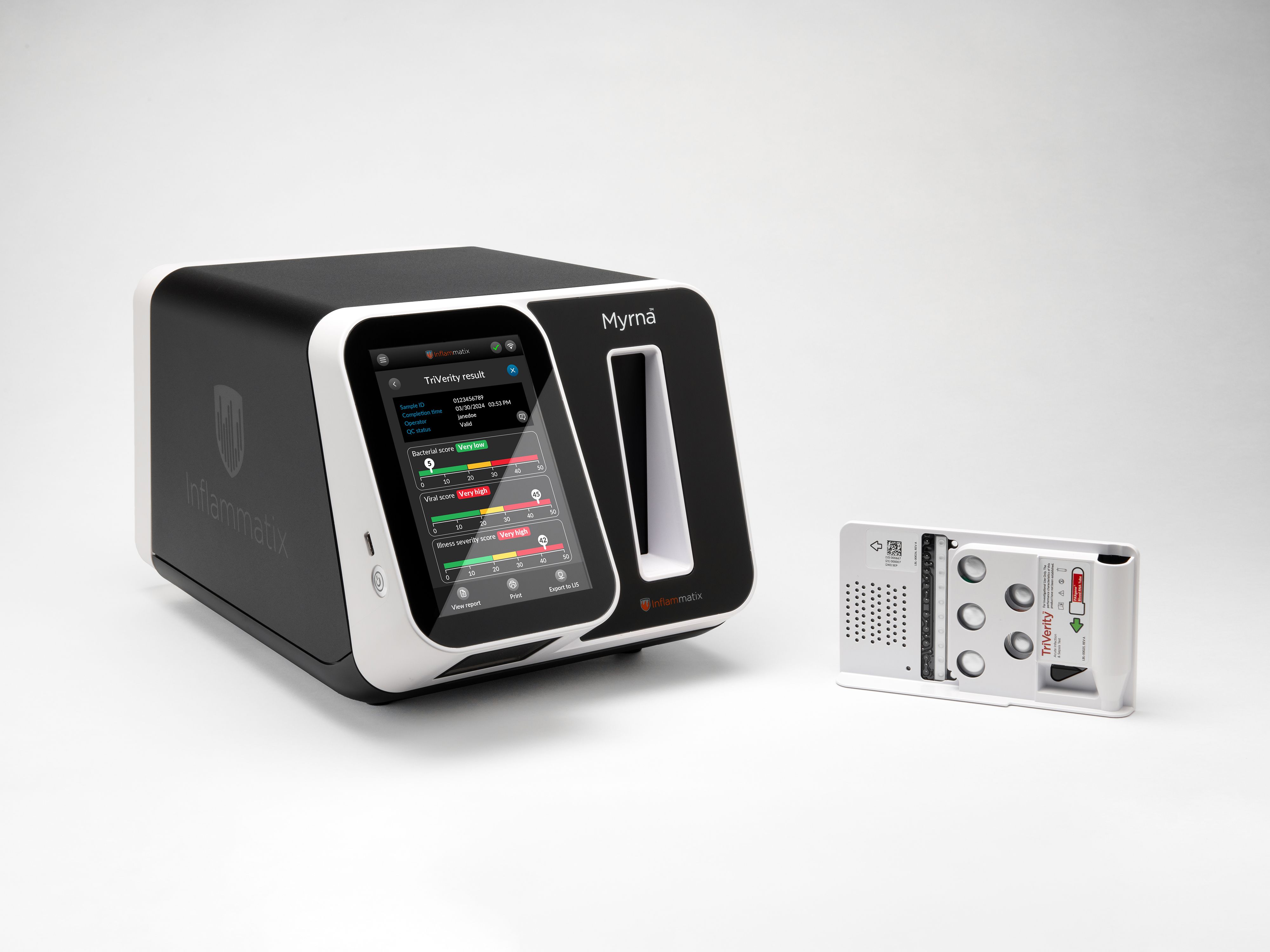
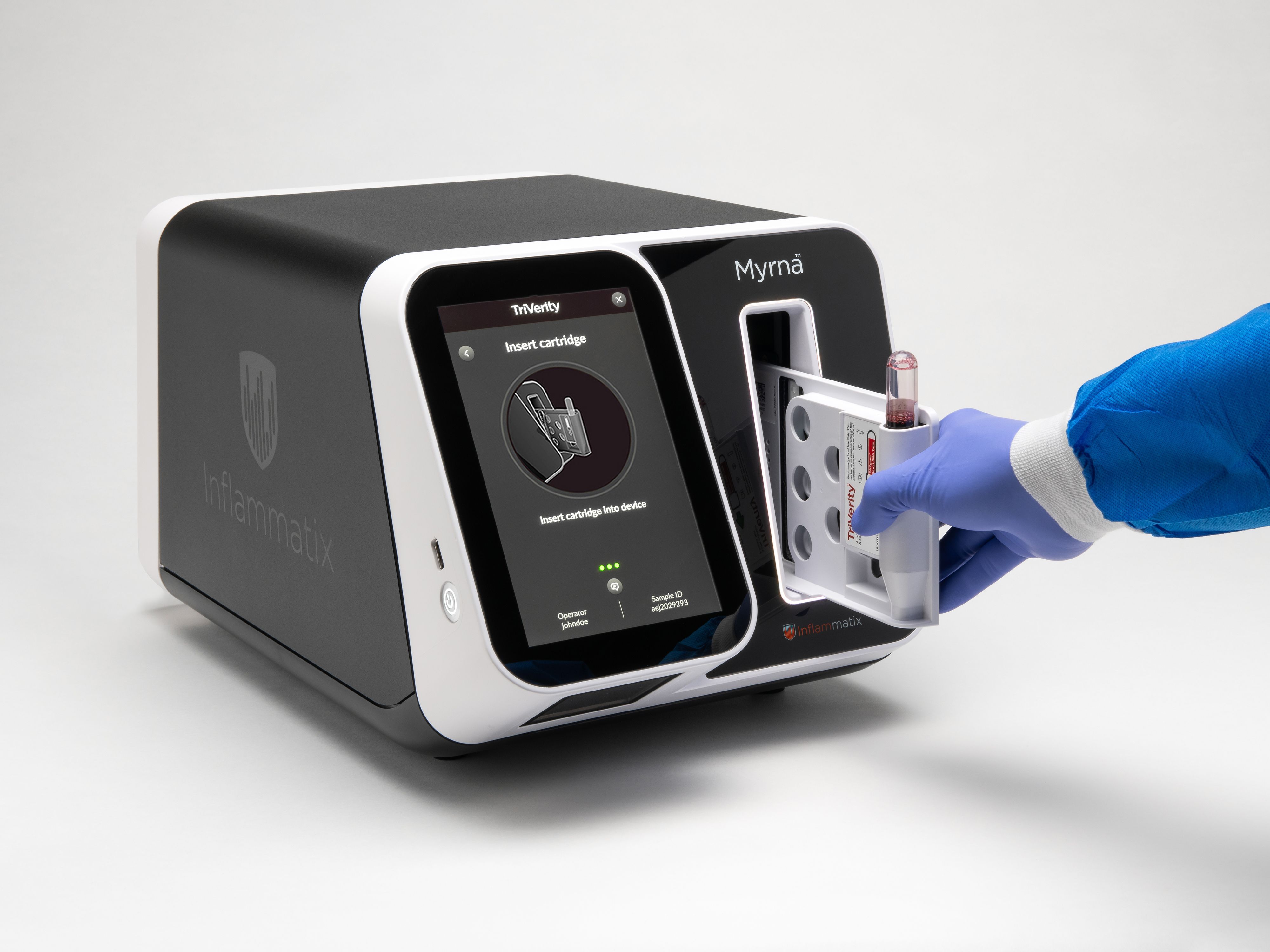
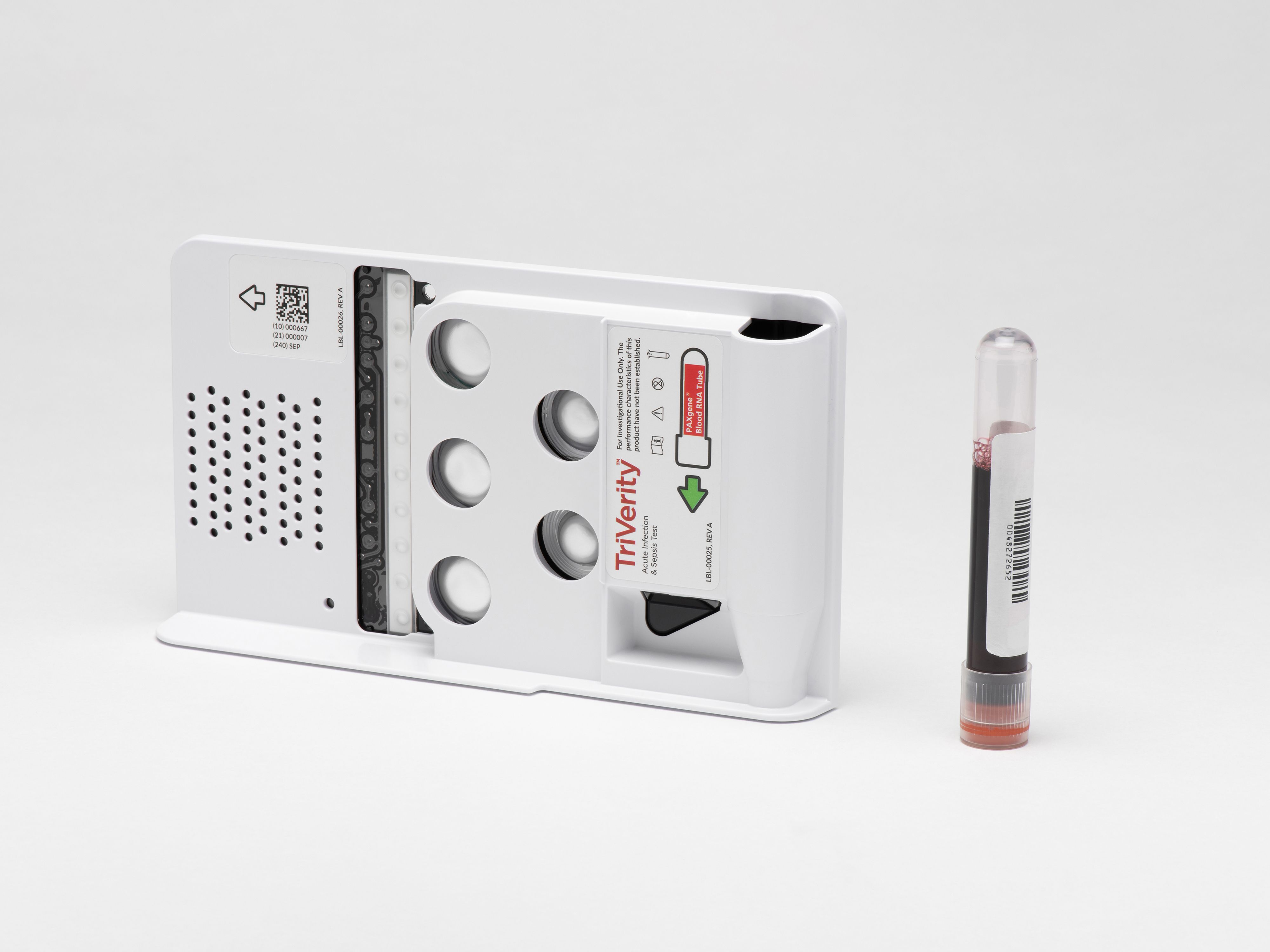
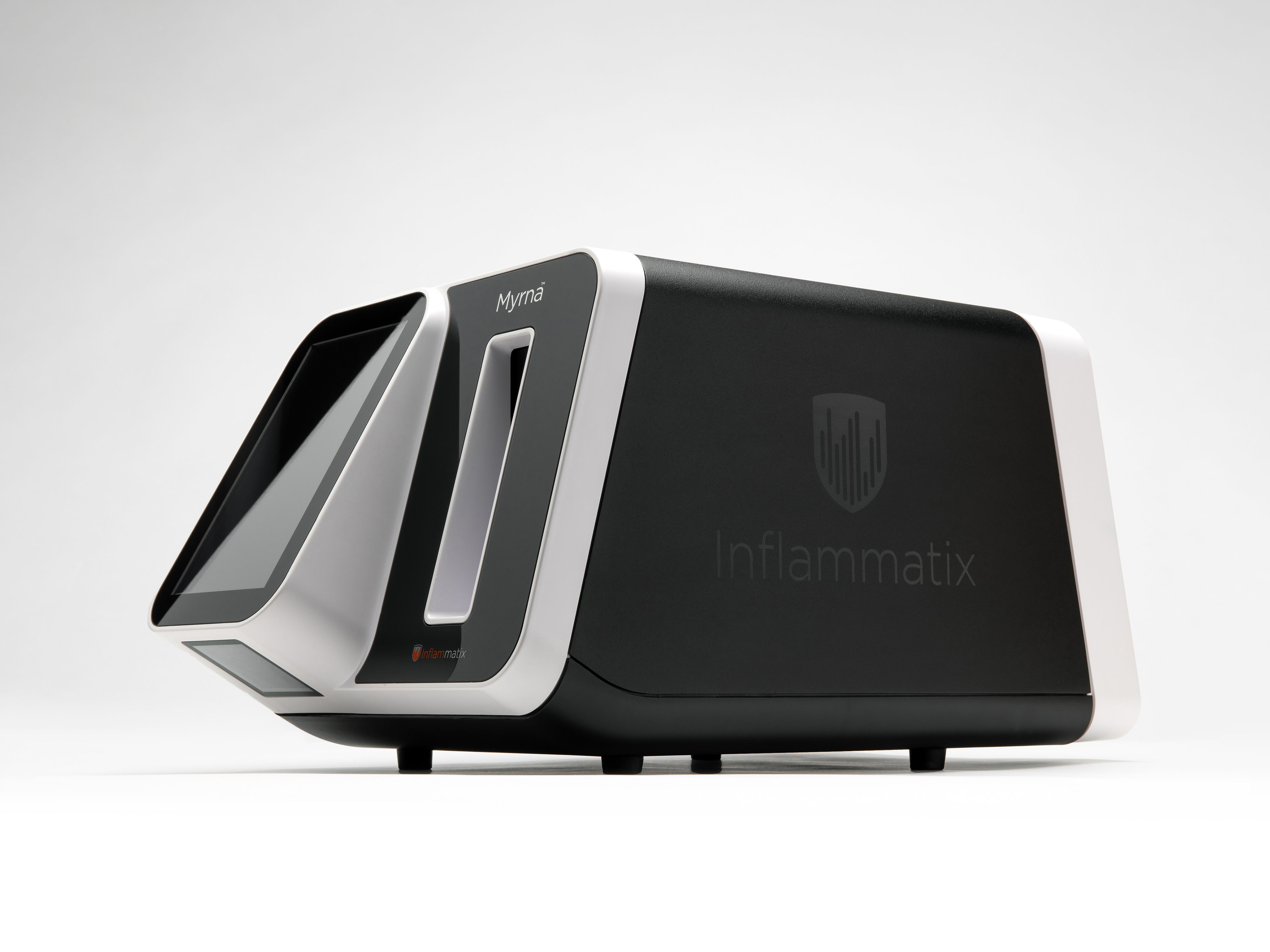
»TriVerity has succeeded in translating a scientific breakthrough in medical diagnostics into an easy-to-use product. It is well suited to the clinical context, e.g. in a hospital emergency room, and guides even untrained users safely through the necessary steps. The product design is ergonomic. Interaction elements on the hardware, such as the barcode scanner or the sample slide, are well integrated with the touchscreen and allow safe, smooth operation. Thanks to these qualities, TriVerity enables faster diagnosis and confident decisions for appropriate treatment.«
Mine Danışman Taşar and Bernhard Staiber
And the award goes to...
Three questions for the project team
What was the particular challenge of the project from a UX point of view?
Healthcare professionals in the emergency department operate in a high-pressure environment filled with distractions. Our design challenge was to create a streamlined and rapid user experience that effortlessly guides users through test workflow setup, delivers clear and actionable results, and ensures safe sample and waste disposal. The resulting design aims to minimize physical interaction with the system, minimize setup time, reduce errors, accommodate lapses in device training, handle interruptions during test setup, and provide clear, visual notifications from afar when test results are ready. This innovative approach empowers healthcare professionals to focus on what truly matters: delivering exceptional patient care.
What was your personal highlight in the development process? Was there an aha!-moment, was there a low point?
The project's highlight was observing end users interact with the system in simulated environments, which was both a humbling and inspiring experience. This revealed user biases that needed addressing to mitigate errors and enhance usability. Initial contextual inquiries and heuristic evaluations informed and refined workflow steps and the structure of the interface. Two formative studies led to further design updates, improving prompts and various physical elements of the design. The summative validation study was a pinnacle, with users successfully operating the system without critical errors and praising its ease of use and pleasure to operate. Their glowing feedback was incredibly rewarding.
Where do you see yourself and the project in the next five years?
In five years, I envision our test system being widely used and incorporated into prominent medical society guidelines. Resulting, the care of millions of patients suspected of acute infection and sepsis would be managed with TriVerity. I see myself continuing to support my personal mission of enhancing patient and clinician experiences through design. Leveraging the Myrna Instrument as a platform for other diagnostic tests that address significant unmet needs, I will have ample opportunities to impact patient care and delight device operators.
