Designers
Jason Occhipinti, Vivian Yu, Aaron Schmelzer, Gilson Hoffmeister, Laura Costa, Daniel Marquez, Gustavo Callegari, Ivy Yu, James Rothbart, Lauren Schmidt, Quyen Nguyen, Anh Huynh, Sanaz Saadatifar, Andrei Garcia
Year
2025
Category
Product
Country
United States
Design Studio / Department
HP Design System, Research and Governance (DSRG)
Three questions to the project team
What was the particular challenge of the project from a UX point of view?
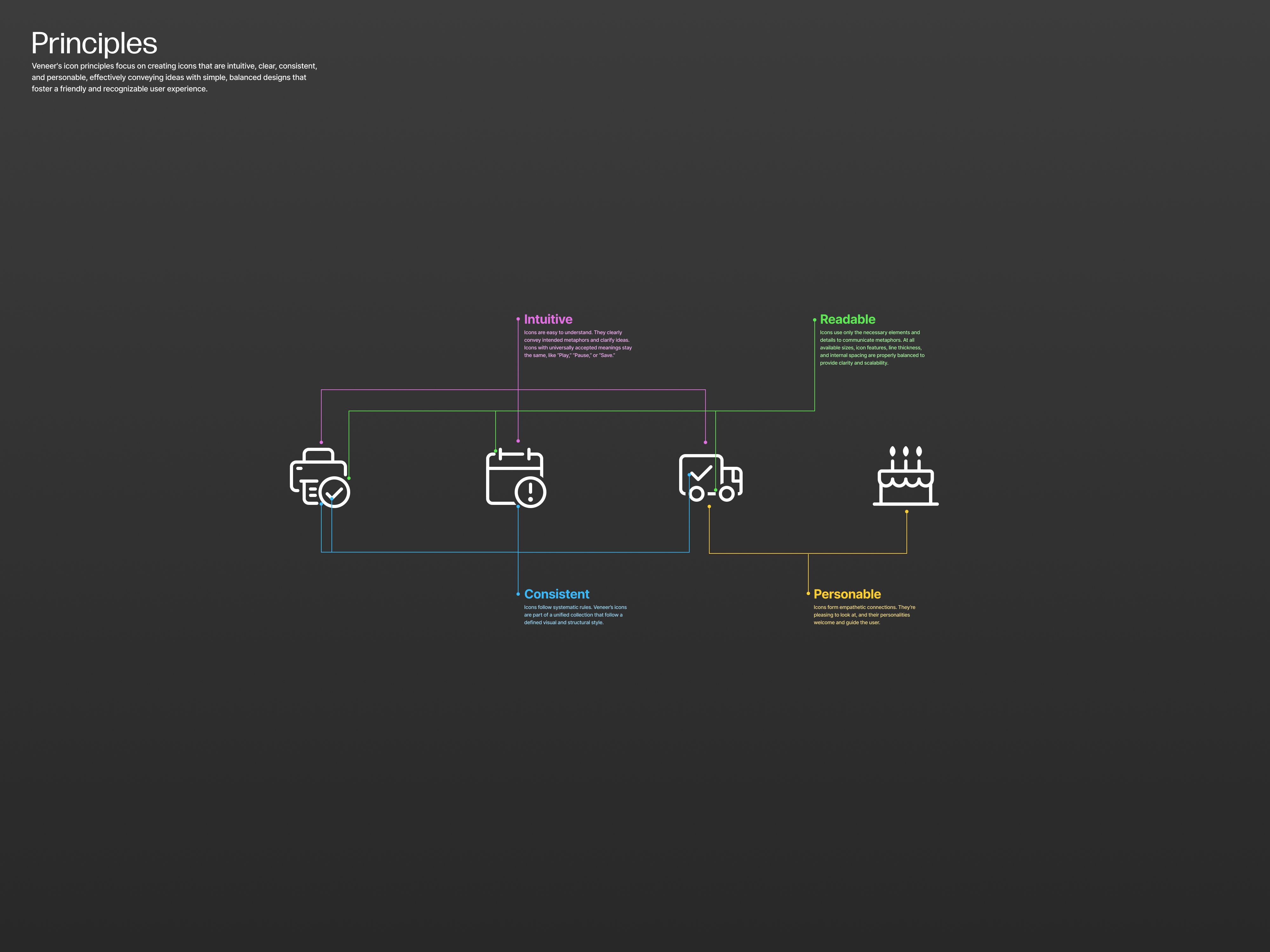
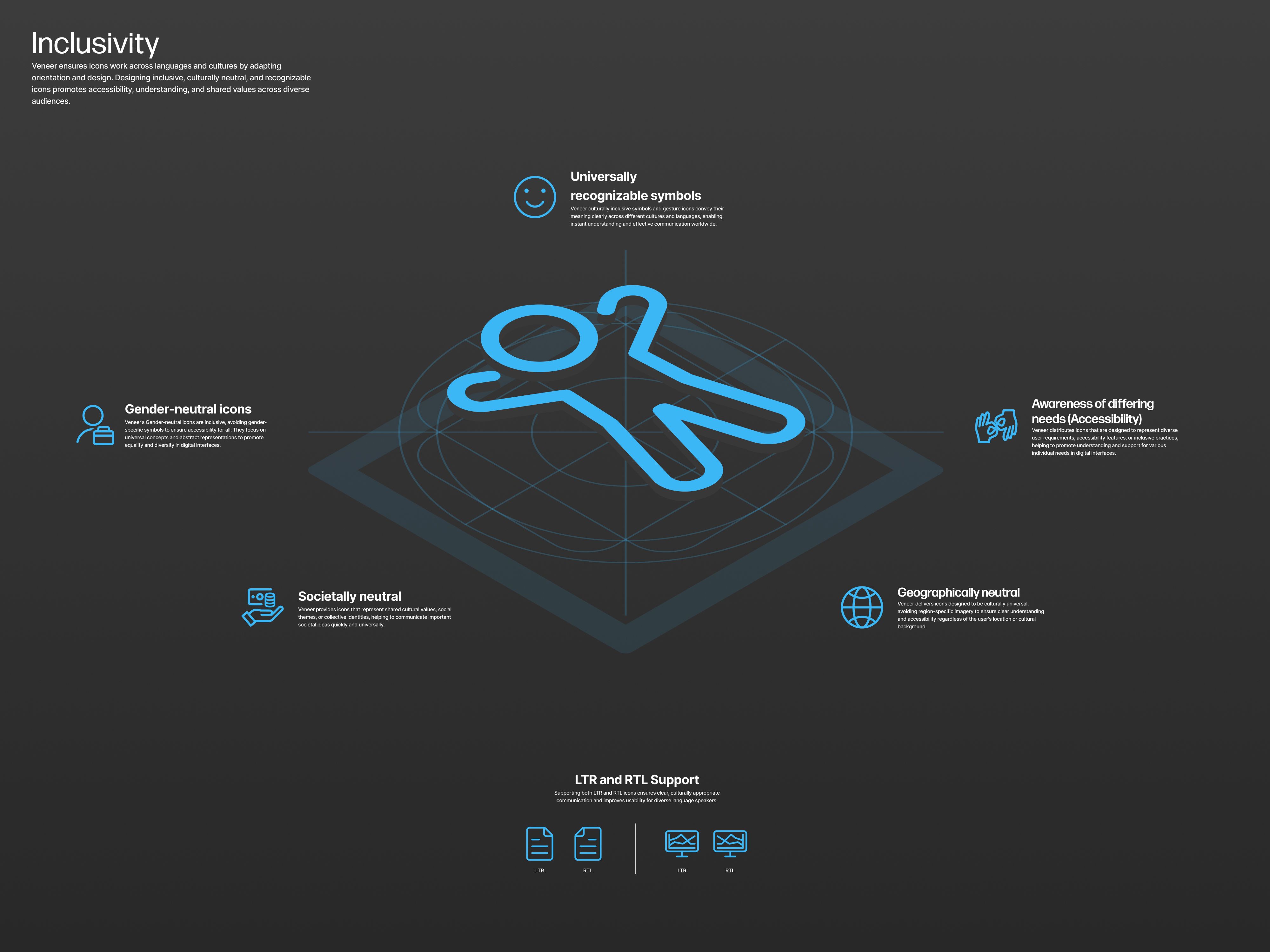
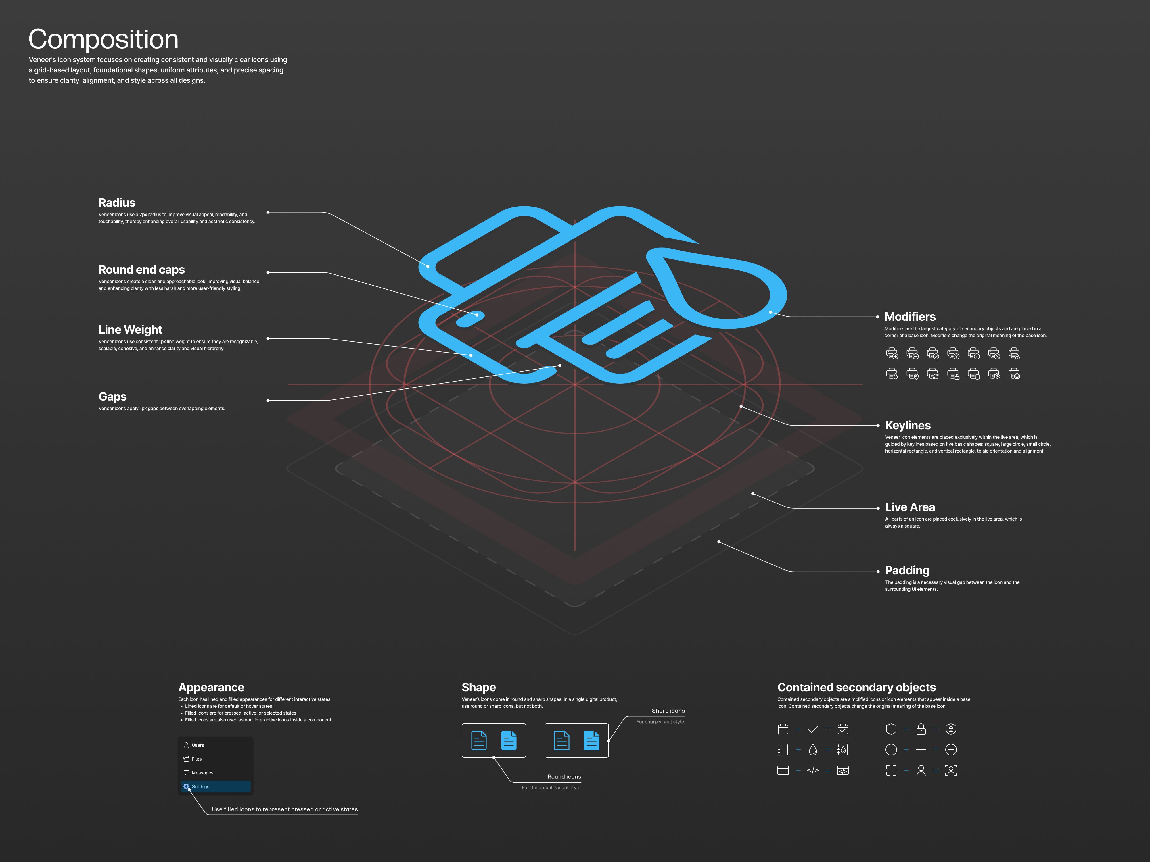
Veneer’s iconography encountered one main challenge: how to balance consistency with flexibility. HP customers needed icons that followed a consistent appearance (and therefore built trust), and HP design teams needed a range of options to adjust the icons however they needed. How could a design system provide iconography that balances visual cohesion (and consolidates varying styles) with the flexibility that digital teams required? The solution was to provide icons of multiple sizes that were sharp and round, filled and lined, and supported in LTR and RTL languages. Total, Veneer’s library has over 20k icons including every icon variation. We also documented principles and cohesive guidelines that streamlined the creation of new icons.
What was your personal highlight in the development process? Was there an aha!-moment, was there a low point?
To unify HP digital icons, Veneer partnered with many HP teams building different digital products. These partnerships presented opportunities to advocate for unified iconography across the company. Many teams agreed on the need for unification, but few were willing to invest extra time in it. Rather than let the work stall, we moved forward with the resources we had. During the audit of HP's iconography, which took much longer, we learned the many reasons why the company’s icons looked the way they did. After synthesizing the results, we discovered that one style would not fit all, but we identified what would work for most teams and published a centralized library to house cohesive, trustworthy digital icons.
Where do you see yourself and the project in the next five years?
Veneer’s iconography will evolve to unify HP’s visual language across all contexts, and it will improve its technical offerings. Currently, Veneer’s iconography is used only in digital contexts; in the coming years, Veneer will deepen its collaboration with HP Brand to create a shared style that works for software, hardware, packaging, marketing, and more. Technically speaking, Veneer will offer even more flexibility: all icons will have the option to display thicker line weights. This improvement will enable them to better complement different styles and contexts, like bold text in UI or being stamped on hardware devices. As a result, Veneer’s icons will be better suited to adapt to many more situations.