Designers
Brittany Sumarsono, Xueyin Liu, Garrett Land, Somin Heo, Zoe Shuk Yu Liu, Angie Nery
Year
2023
Category
Product
Country
United States
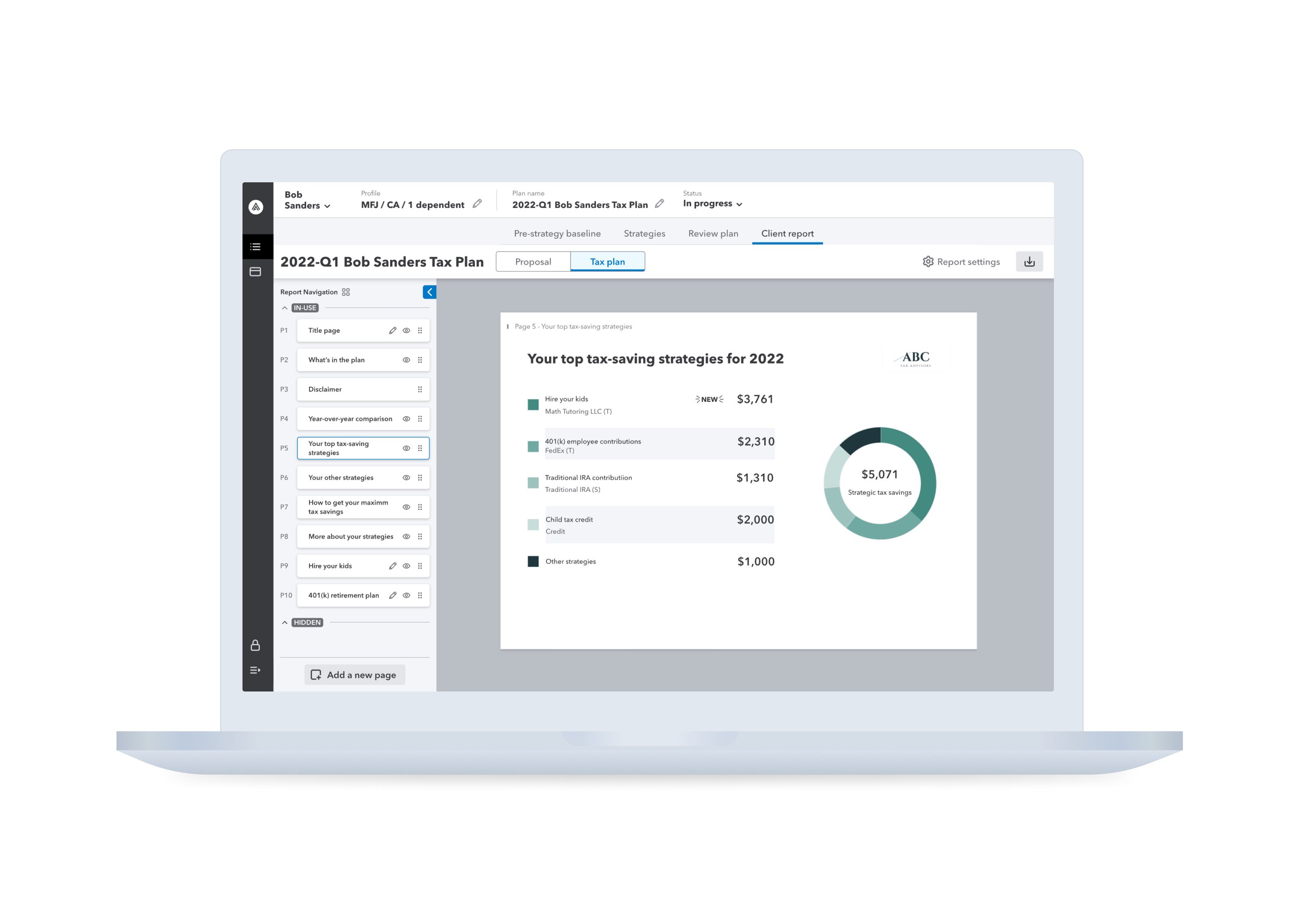
»The jury recognizes how ‘Intuit Tax Advisor’ helps tax advisors improve their skills and provides them with access to new areas of knowledge, enabling them to move on to strategic advice. In addition, the application provides benefits to clients by enabling advisors to present tax results and strategic advice in an understandable and transparent way. The product was developed on the basis of extensive user research, flanked by continuous testing and the involvement of all stakeholders throughout the process.«
Lisa Gerkens & Nancy Birkhölzer
And the Award goes to...

Three questions for the project team
What was the particular challenge of the project from a UX point of view?
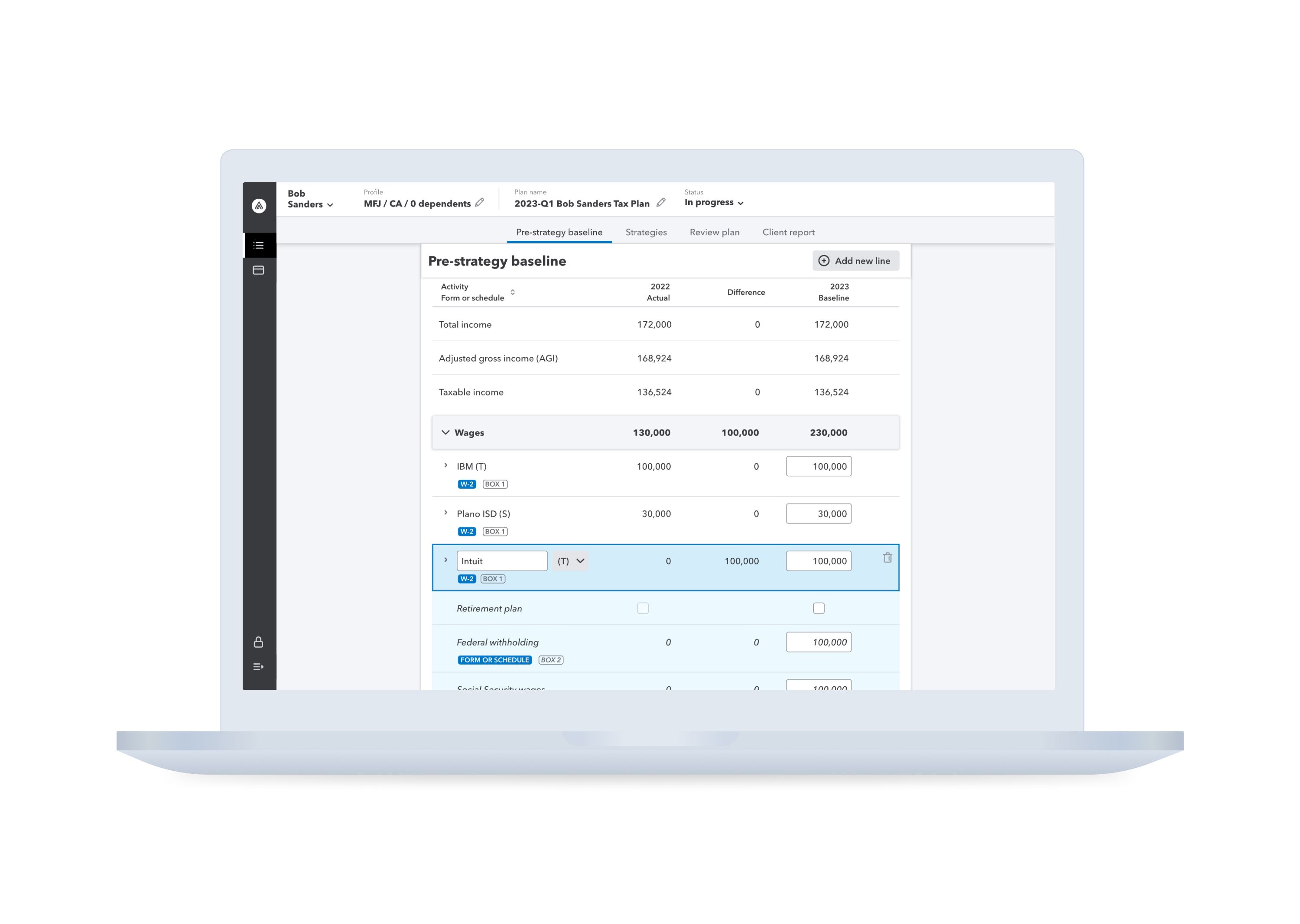
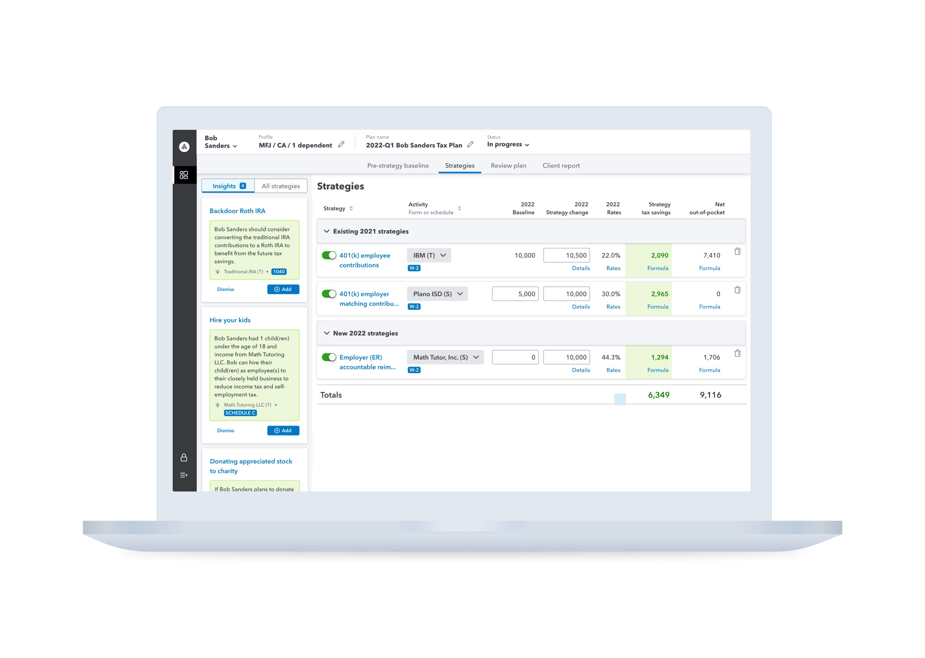
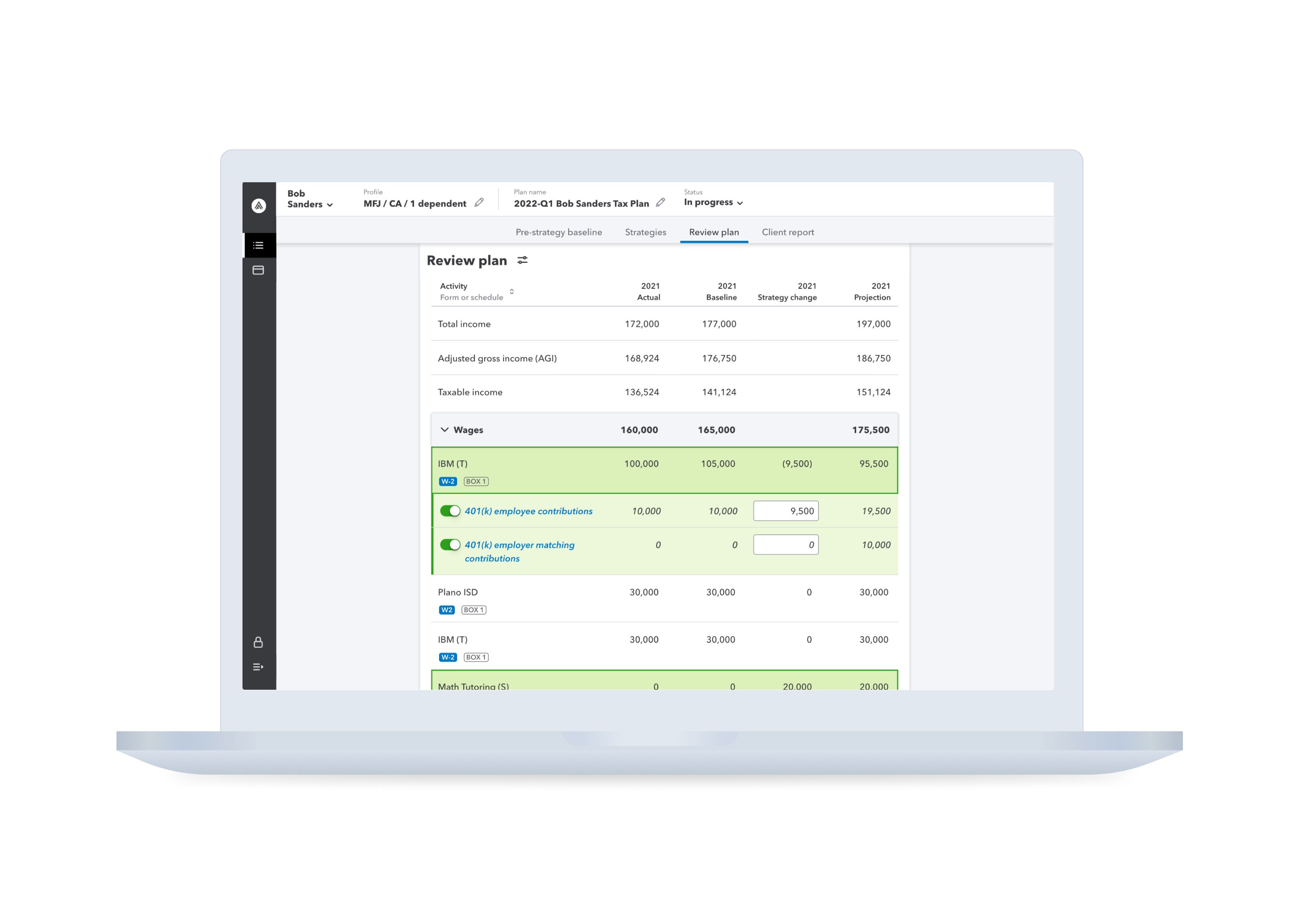
There is an industry shift occurring within the professional tax space where tax preparers are looking to move beyond compliance work and start providing proactive advisory services. However, there are no standardized workflows for them to easily achieve that goal. The main aim of Intuit Tax Advisor (ITA) is to provide a one-stop experience for advisors to quickly quantify and communicate tax-saving strategies for their clients. One of the biggest UX challenges we face with ITA is striking a balance between simplicity and reliability. ITA wants to empower advisors to complete a tax plan within 15 minutes. However, tax can be extremely complicated. It’s challenging to keep the flow simple and present only digestible information while ensuring users can still understand how the complex tax strategies work so they feel confident enough to present the plan to their clients.
What was your personal highlight in the development process? Was there an aha!-moment, was there a low point?
One aha moment for Intuit Tax Advisor was the fake door test we conducted to validate the market need before developing the product. We created a fake landing page to gauge interest in the product and the result was an impressive conversation rate of 17%. For context, a typical landing page conversion rate is between 3-5%. We were encouraged by the results and so was our leadership team. A low point in our UX process was the Alpha test conducted after 5 months of rapid development. The goal was to test whether what we had built could be viewed as a minimally viable product. Contrary to our hopes, we received a low net-promoter score. Users liked the direction we were going with the product, but a lot needed to improve in order for them to start using it (e.g. more strategies and a more robust client report). On the bright side, we were able to get the resources needed to enhance the product based on participants’ feedback.
Where do you see yourself and the project in the next five years?
As designers for Intuit Tax Advisor, we plan to continue building products that power prosperity for everyone, especially accounting practices and small businesses. We want to gain a best-in-class net-promoter score from our users and empower tax accountants to have the confidence to step into the advisory world and focus on high-value, meaningful work. We envision Intuit Tax Advisor to be increasingly more robust and powerful, with new features and content such as: more complex strategies, a client collaboration platform for users to proactively communicate with their clients, AI/ML capabilities to make better strategy suggestions while integrating data from broader channels, and more.


