Designers
Stefanie Birk, Enno Voigt
Year
2021
Category
Concept
Country
Germany


Three questions to the team
What was the particular challenge in the project from a UX point of view?
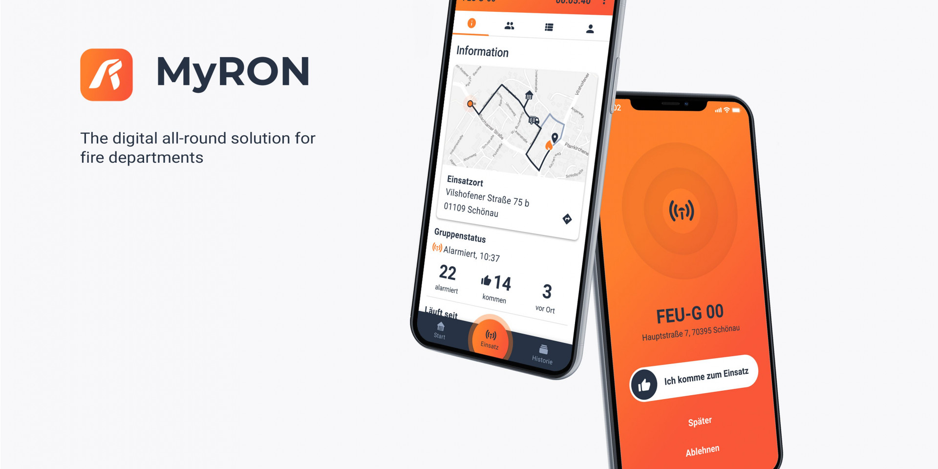
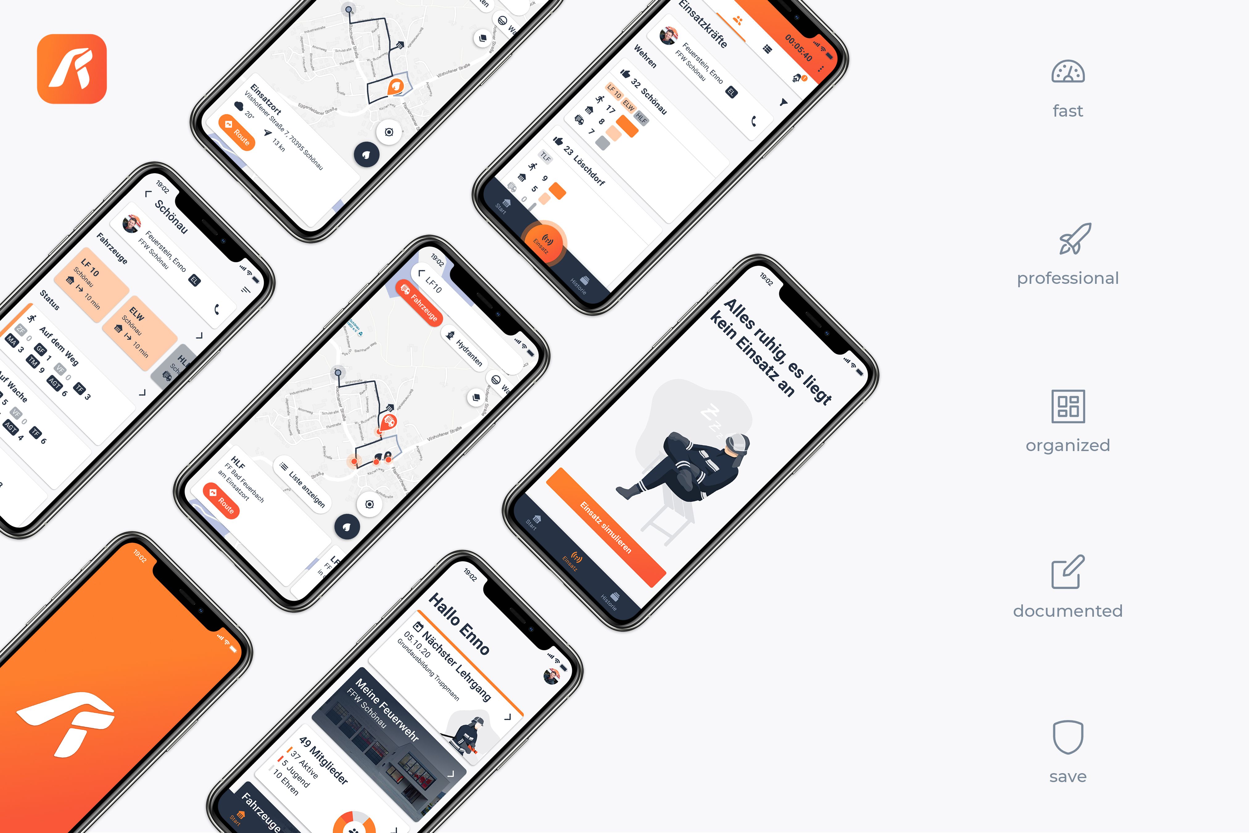
During an emergency, the user is under extreme stress. Therefore, the UI needs to be highly intuitive, immediately showing all information without distracting from the current task. One major challenge was to structure the large dataset within a mobile viewport to be easily accessible in all circumstances. To reduce unnecessary interaction, a major goal was to safely collect data automatically and provide fast and easy communication through speech, text or images for additional input.
What was your personal highlight in the development process? Was there an aha! moment, was there a low point?
There were many highlights! The whole team enjoyed the monthly usertests with many interesting insights and positive reactions. Statements such as “Not as expected, but better” were extremely motivating for our team. One little setback was during the creation of an economical business model, when we realized that we couldn't provide this solution to the user for free.
Where do you see yourself and the project in the next five years?
We hope that in 5 years' time this application will be available to every emergency responder in Germany, making missions safer and easier. Therefore, we are hoping to find a partner to bring our MVP to the market and implement more features with us.
