Designers
GoTyme Bank Design Team / Silvano D'Orazio, JM Elimanco, Van Nguyen, Long Tran, Hoa Linh Mai, Isabel Abella, Hai Tran, Phong Nguyen, Tram Nguyen, Valentin Cheval, Hieu Cao, Christine Enerlan, Minh Le
Year
2023
Category
Product
Country
Philippines
»Banking should not be a privilege, but a commodity accessible to all. And yet, in The Philippines, a substantial amount of people remain underbanked or even unbanked. With this backdrop, GoTyme Bank App exemplifies how banking should be: unfussy (people can imagine it), relatable (reflecting real-life situations) and satisfying (snappy and delightful). GoTyme does all of this with world-class visual-style and verve that is rarely seen in the banking industry, but sorely needed. Putting consistent focus on everyday needs (however trivial they might appear) is a mindset that other banks would do well to heed. Brands such as GoTyme who put people (and not just the privileged) first and go the extra mile in design do deserve to win. Not just a UX Design Award, but in the market.«
Joon-Mo Lee & Shruti Ramiah

Three questions for the project team
What was the particular challenge of the project from a UX point of view?
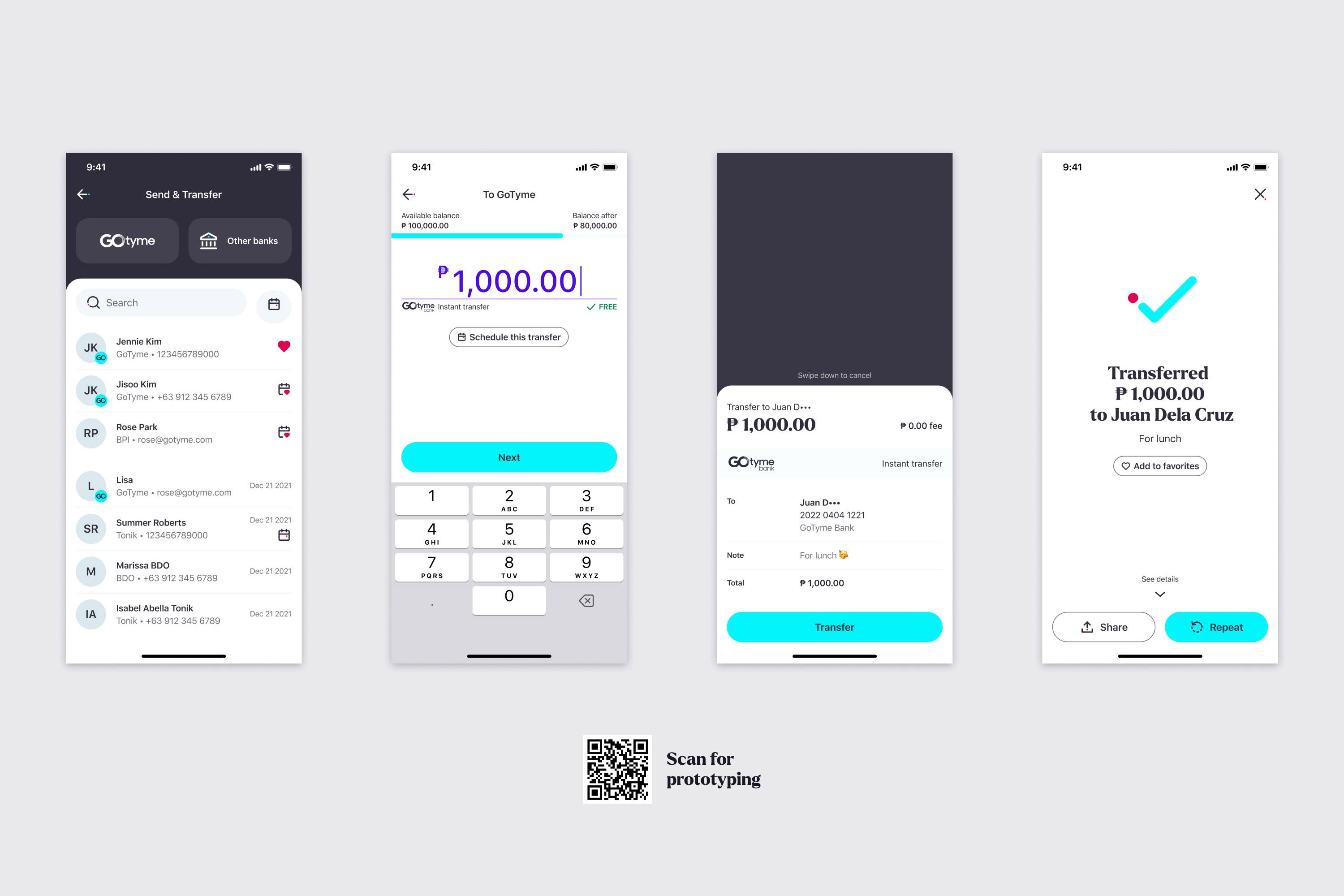
The challenge of designing the GoTyme Bank App was maintaining a cohesive user experience across the different basic features expected of a local digital bank as well as the integrations that enabled those features, all while ensuring that each journey was built on research and global accessibility standards. Certain mission-critical API integrations tended to increase fragmentation in terms of UX and present technical limitations, which the team had to be creative and assertive enough to overcome. As developers of a strictly regulated financial app, the team also had to strike the balance between security and usability. Raising the bar for usability often clashed with the need to be fully compliant with regulatory requirements.
What was your personal highlight in the development process? Was there an aha!-moment, was there a low point?
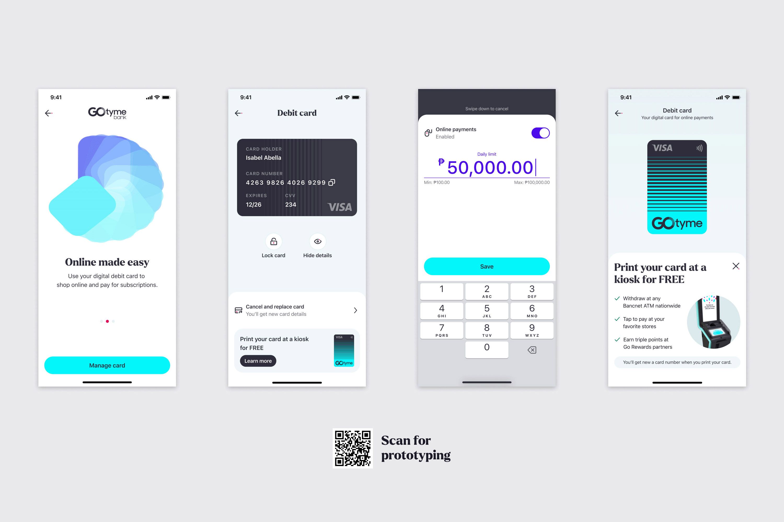
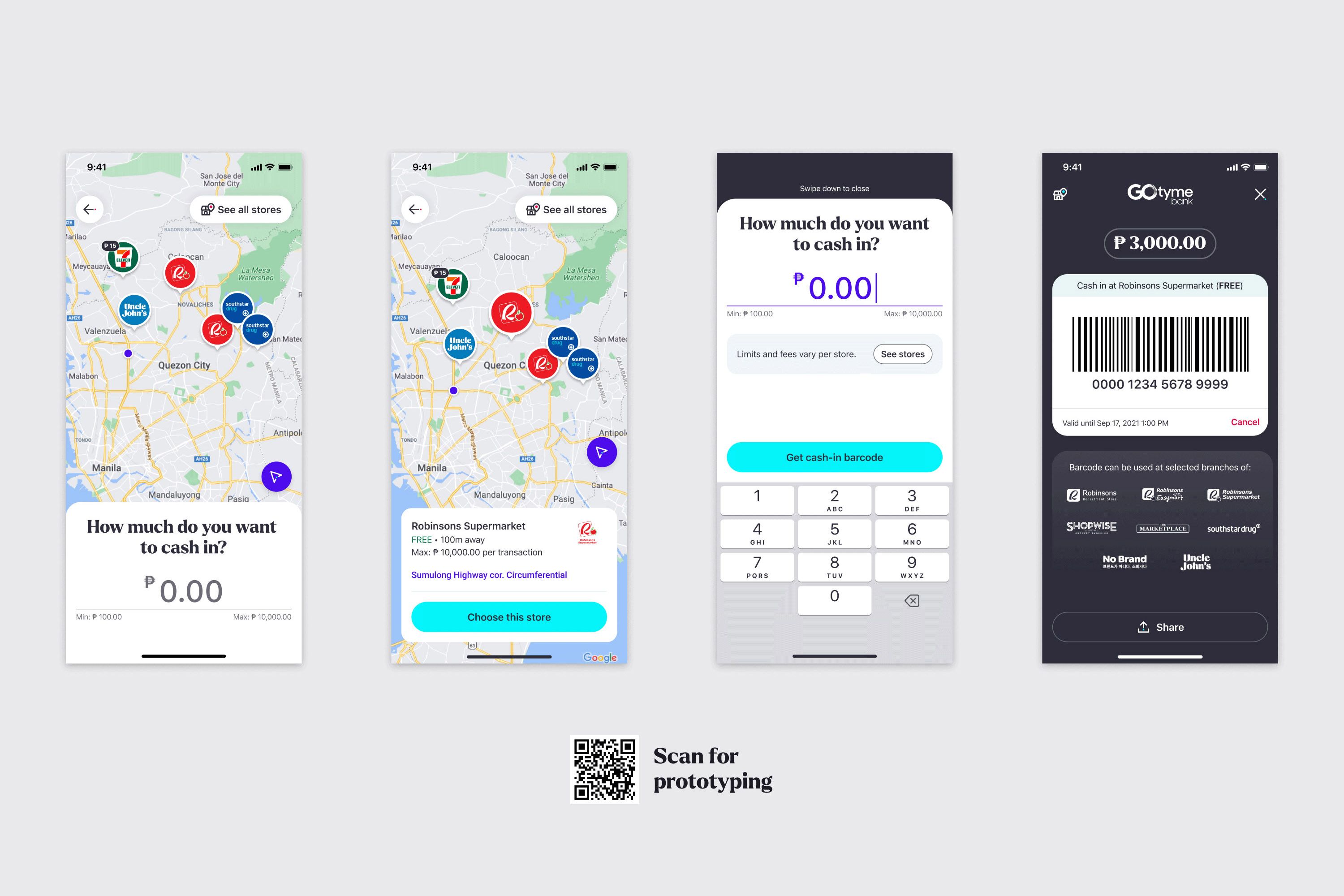
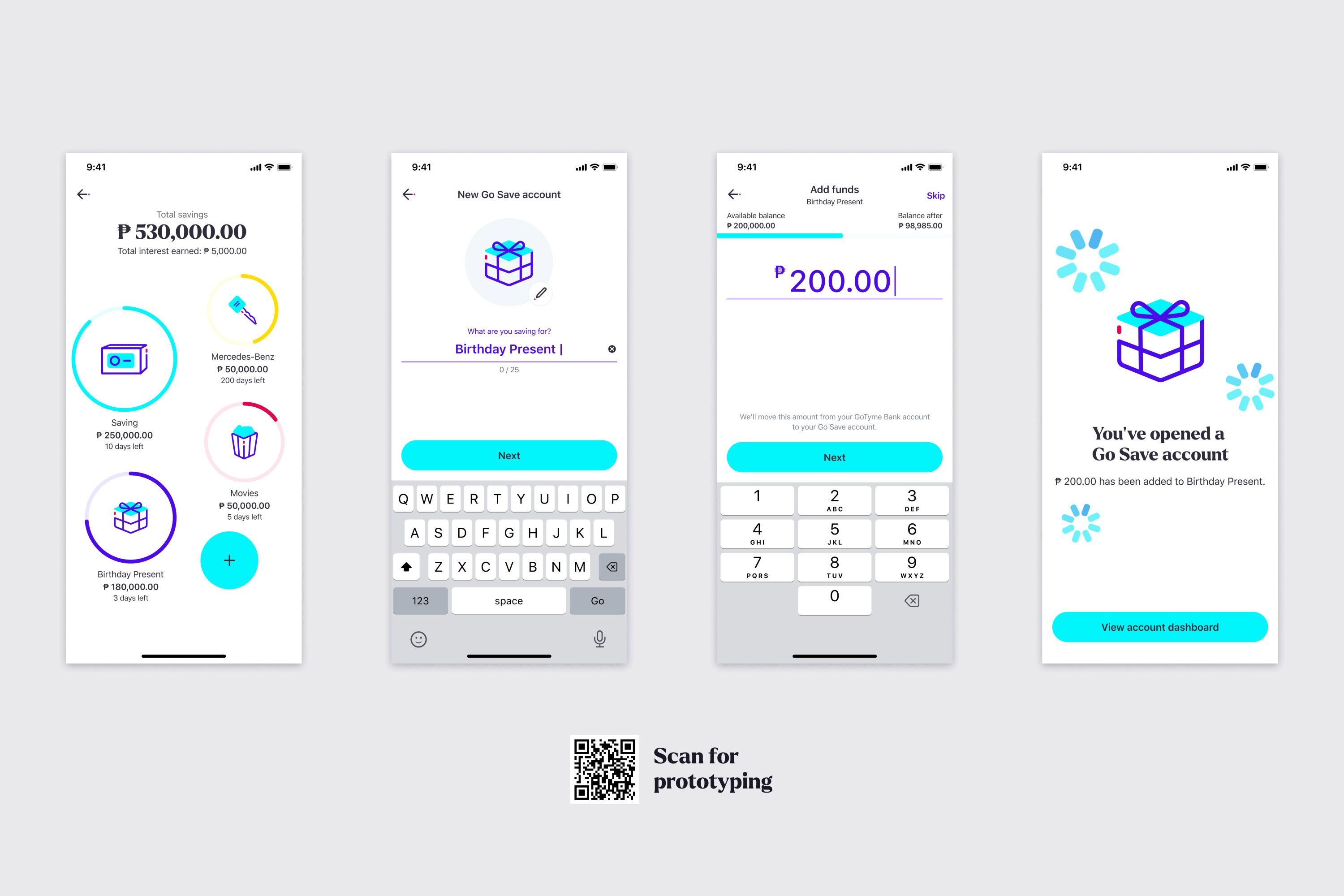
The highlight of the project was the series of usability tests that the team conducted for the GoTyme Bank App’s core features. The usability tests validated most of the team’s initial assumptions and even revealed that the many of the designed solutions, from key differentiators like the map view of physical touchpoints to simple touches like letting users personalize their savings accounts with their preferred images (which they cannot do on other banking apps), exceeded expectations. Finding out from research and online community feedback that those features actually helped engage users was the team’s a-ha moment. To date, the project, which is relatively still in its early stages, has had no major low point worth considering.
Where do you see yourself and the project in the next five years?
The team aims to continue designing and building for scalability to support its plans to make credit, investment, and insurance products available on the app. This is in keeping with the overall goal of reaching 10 million users in 5 years and helping more underbanked and unbanked Filipinos unlock their financial potential.


