Designers
Saskia Balven-Kreuz, Anna Mühlhauser, Kerstin Fels, Christian Kilian, Marcel Höhne
Year
2024
Category
Product
Country
Germany
Design Studio / Department
Valtech, Experience Design, AXA

Three questions for the project team
What was the particular challenge of the project from a UX point of view?
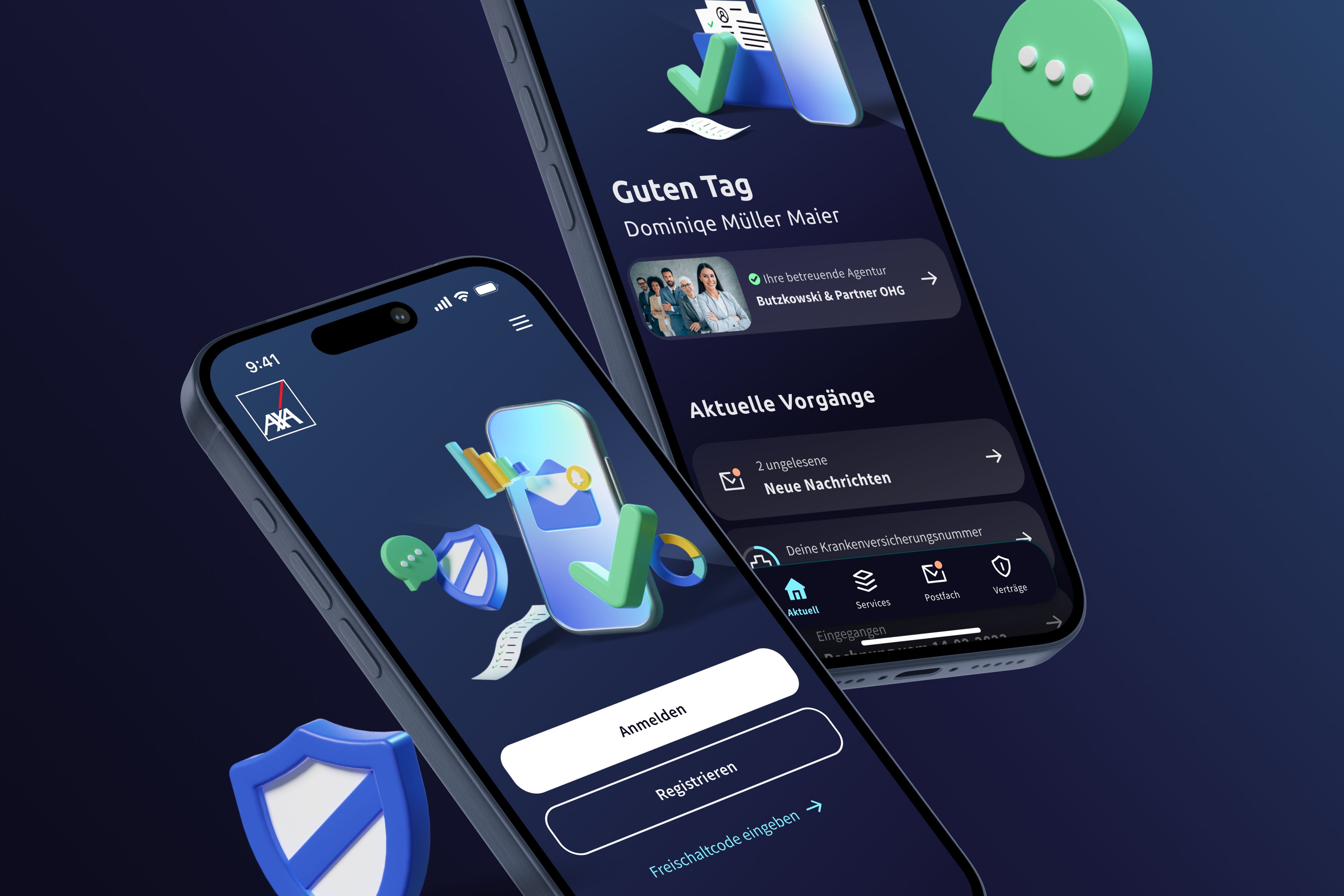
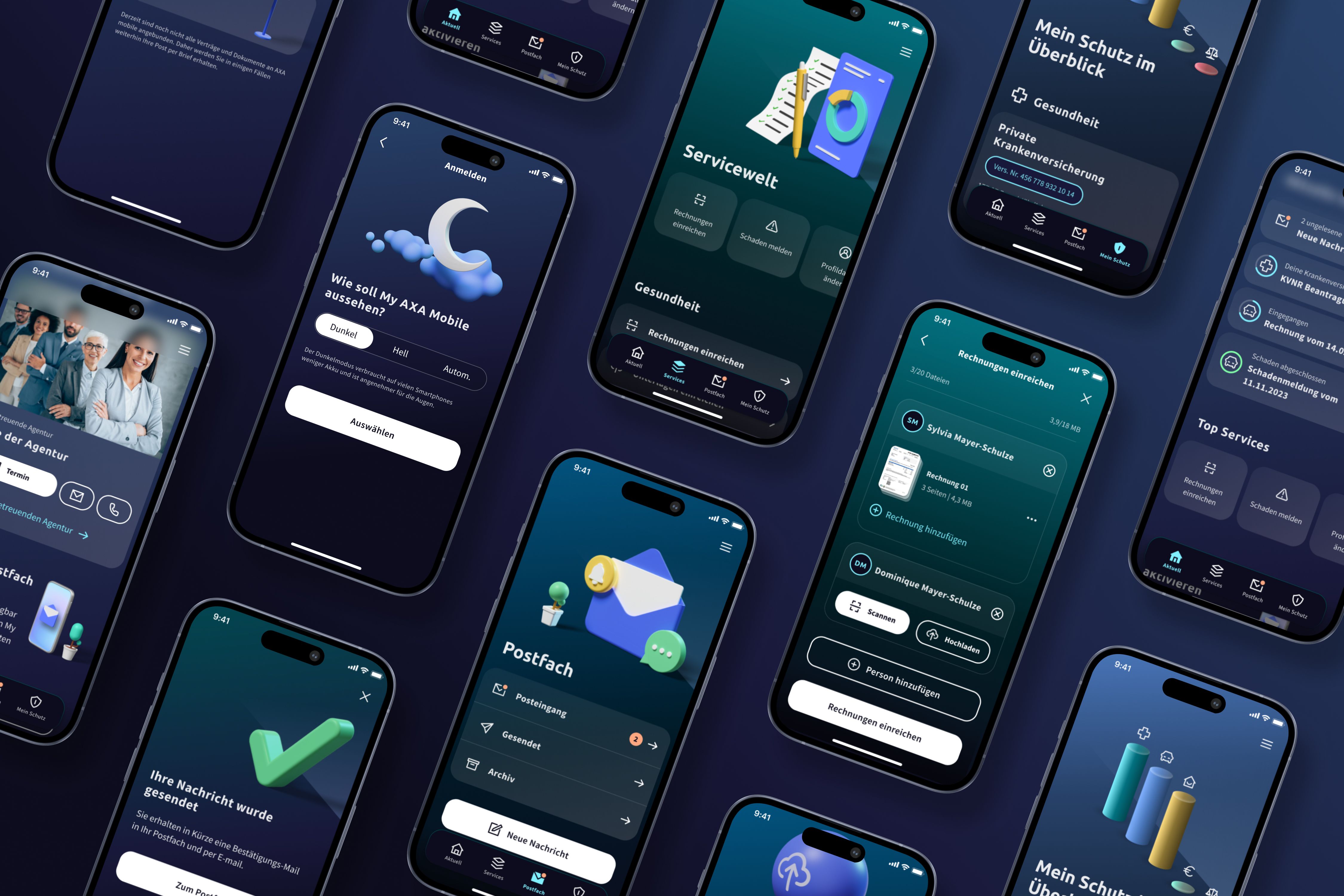
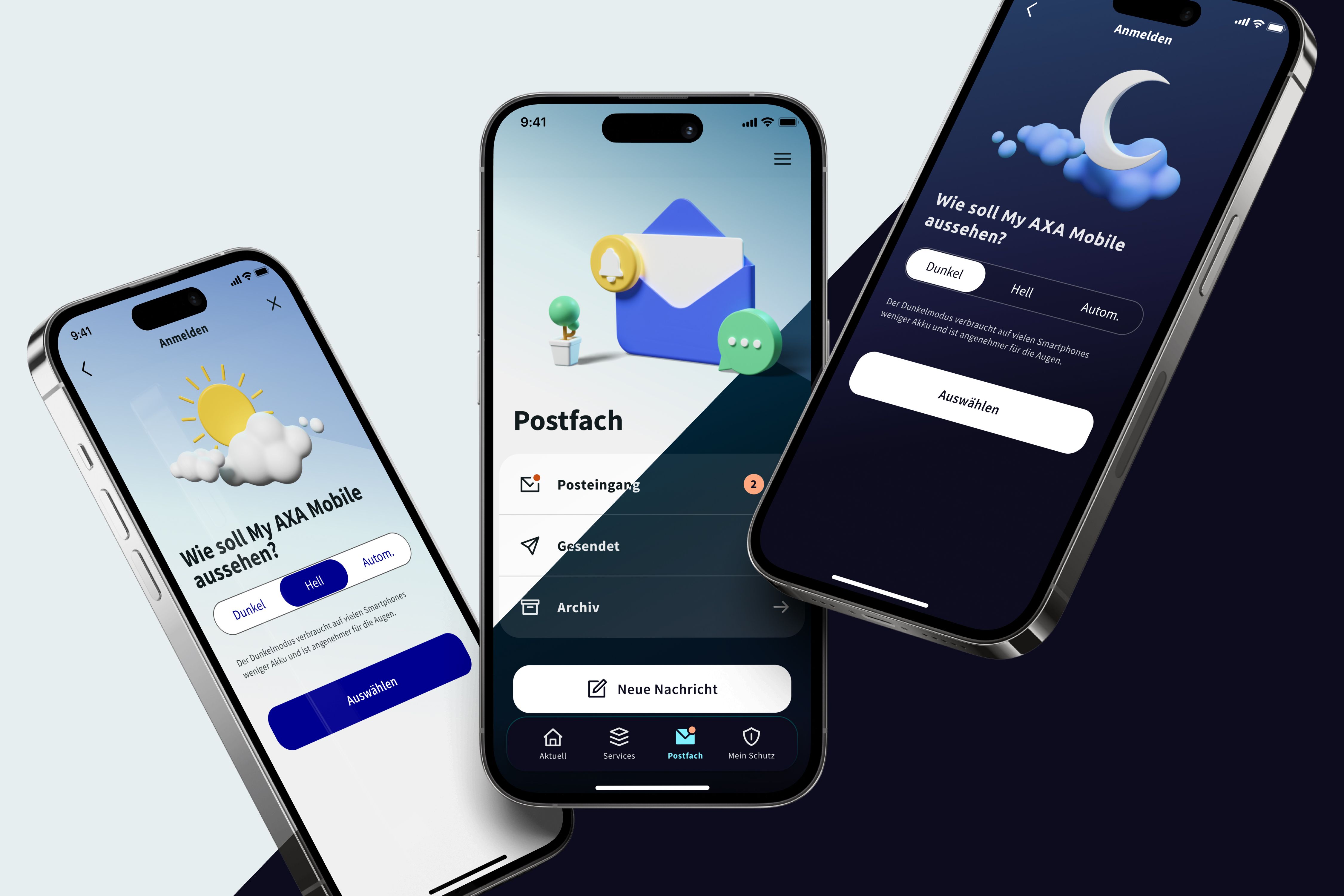
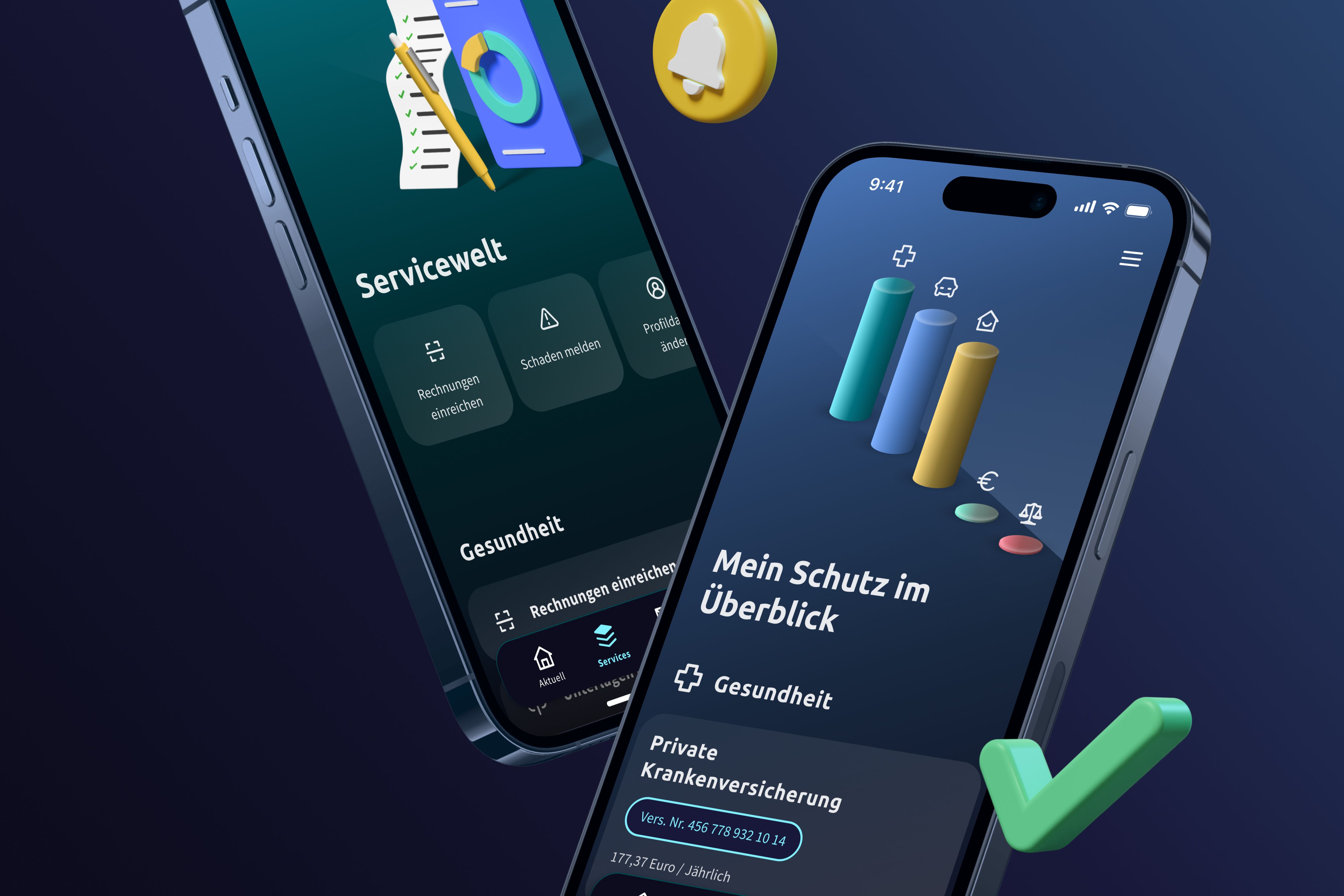
Nowadays, the term insurance is not always associated with simplicity, joy and ease. That was our motivation to do things differently and help people take more interest in insurance and make better insurance decisions. AXA already had a customer portal app but, it was rather functional than joyful. With lots of patience, we again and again brought the users perspective to the table and tried to exceed their needs and expectations. We also added many animations, small feedbacks and little winks, to turn a bit of the seriousness into something enjoyable. It was a fine line between enough joy of use and being too childish.
What was your personal highlight in the development process? Was there an aha!-moment, was there a low point?
During our app development, we used the freedom to implement innovative ideas and pursue a user-centered approach that focuses on the needs and wishes of our customers. Our personal highlight was that for the first time, we were able to not only incorporate topics such as animation and feedback into the product, but to really focus on them. We were also able to identify topics that not only help customers, but also have added value for other stakeholders. We had an eye-opener when we tried to solve the problem, that many users were replying to automated messages from AXA, creating a lot of work for the support. We realized that users felt the need to say "thank you". We added a like button that gives visual feedback – without complex implementation effort.
Where do you see yourself and the project in the next five years?
The number of users actively using AXA's digital services is constantly increasing and they need a touchpoint with an excellent experience that reflects the values of the AXA brand. AXA wants to be "Number One Digital Partner" and the app should push into that direction as well. We want to develop the app into a real partner in the insurance sector - and provide users and tied agents real added value in various life situations. We see a bright future in front of us as the collaboration with the developers and business is really good. Ideas from all directions are included, no matter who had them. The developers try out their own ideas directly in the code - what more could you want?


